Coloring your ggplot2 art like a pro
06 November 2021
ggplot2 is a popular tool for generative art, but it was not originally developed for this purpose, and sometimes its design can get in the way of artistic expression. Nowhere is this more obvious than in the context of applying colors to different parts of a plot. ggplot2 makes strong assumptions about how many different color scales there can be in a plot (exactly one) and how color palettes should be designed (to represent categorical, sequential, or diverging data). These opinions make sense in the context of data visualization, but they generally are invalid when making art. However, there are elegant strategies for applying colors in a more artistic fashion, and here I am going to describe some strategies I commonly use.
Let’s first load the required libraries. We will use {tidyverse} for data manipulation and plotting and {colorspace} for color manipulations.
library(tidyverse)
library(colorspace)
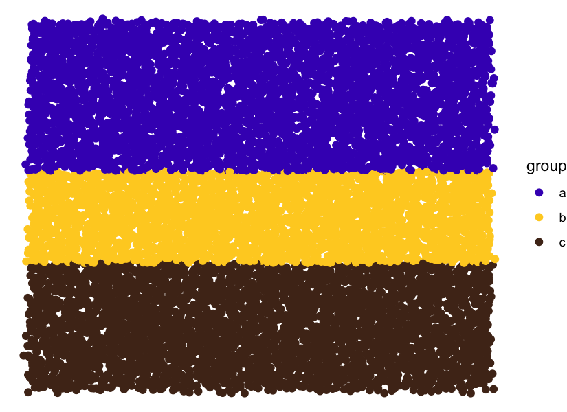
Next, let’s set up the basic structure of the artwork I’m planning to
create. I will distribute points across the canvas and color them with
three different colors, a blue, a yellow, and a brown. To distribute the
points, I place them onto a regular grid and then jitter a bit by adding
Gaussian noise. The color of each point is determined simply by the
point’s y position. We can color the points by setting up a categorical
variable (here called group) and then using scale_color_manual() to
map the different groups to specific colors.
n <- 100    # number of points along one dimension (x or y)
sd <- 0.006 # amount of noise applied to x and y of each point

data <- tibble(
  x = rep((1:n)/n, n) + rnorm(n*n, sd = sd),
  y = rep((1:n)/n, each = n) + rnorm(n*n, sd = sd)
)

data %>%
  mutate(
    group = case_when(
      y > 0.6 ~ "a",
      y > 0.35 ~ "b",
      TRUE ~ "c"
    )
  ) %>%
  ggplot(aes(x, y, color = group)) +
  geom_point(size = 2) +
  scale_color_manual(
    values = c(a = '#4413BF', b = '#FECF26', c = '#502F1C')
  ) +
  theme_void()
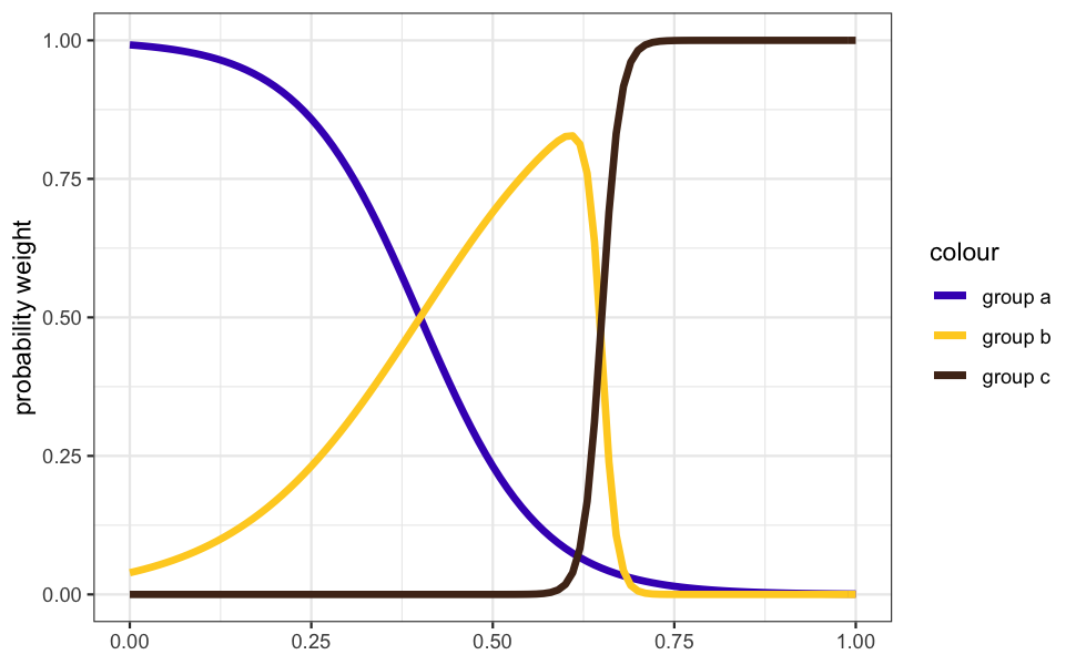
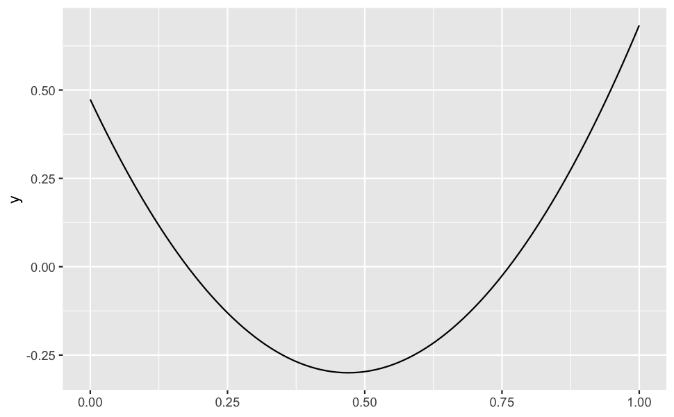
However, I don’t envision the colored stripes to be so clearly separated. I’d like them to run somewhat into each other. This requires coloring the points probabilistically. We can do so by setting up some sigmoidal/double-sigmoidal functions that we use to define the probability weights with which colors are chosen. This will create a relatively smooth transition from blue to yellow and then a sharper gradient from yellow to brown.
sigmoid <- function(x, x1 = 0, slope = 1) {
  1 / (1 + exp(-100*slope * (x - x1)))
}

dsigmoid <- function(x, x1 = 0, x2 = 1, slope1 = 1, slope2 = -1) {
  sigmoid(x, x1, slope1) * sigmoid(x, x2, slope2)
}

ggplot(NULL) +
  geom_function(
    aes(color = "group a"), size = 1.5,
    fun = sigmoid, args = list(x1 = 0.4, slope = -0.12)
  ) +
  geom_function(
    aes(color = "group b"), size = 1.5,
    fun = dsigmoid, args = list(x1 = 0.4, x2 = 0.65, slope1 = 0.08)
  ) +
  geom_function(
    aes(color = "group c"), size = 1.5,
    fun = sigmoid, args = list(x1 = 0.65, slope = 0.8)
  ) +
  scale_color_manual(
    values = c(`group a` = '#4413BF', `group b` = '#FECF26', `group c` = '#502F1C')
  ) +
  theme_bw() + xlim(0, 1) + ylab("probability weight")
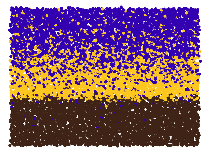
Now that we have these functions representing probability weights, we
can use them to stochastically assign group membership to each point.
But because each point has its own y value, and the probability weights
depend on y, we cannot use a single vectorized call for the random
sampling (as far as I’m aware). Instead, we use pmap_chr() from the
{purrr} package to sample each point individually.
data %>%
  mutate(
    p1 = sigmoid(1 - y, x1 = 0.4, slope = -0.12),
    p2 = dsigmoid(1 - y, x1 = 0.4, x2 = 0.65, slope1 = .08),
    p3 = sigmoid(1 - y, x1 = 0.65, slope = 0.8),
    group = pmap_chr(
      list(p1, p2, p3),
      function(p1, p2, p3) sample(letters[1:3], 1, prob = c(p1, p2, p3))
    )
  ) %>%
  ggplot(aes(x, y, color = group)) +
  geom_point(size = 2) +
  scale_color_manual(
    values = c(a = '#4413BF', b = '#FECF26', c = '#502F1C')
  ) +
  theme_void()
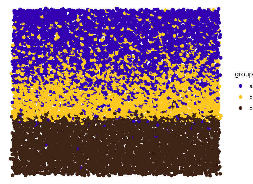
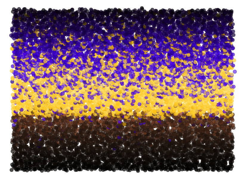
As you can see, this works fine. However, in practice, I don’t like to
assign groups to data points and then map those groups onto colors. I’d
rather work with colors directly. Fortunately, this is actually very
easy. We just need to create a data column with RGB hex codes, map that
column onto the color aesthetic, and then use as our scale function
the function scale_color_identity().
Let’s try this out. To simplify the code, we also define a function
setup_data() that creates the input data and then a function paint()
that does the actual drawing. setup_data() looks as follows.
setup_data <- function(n = 100, sd = 0.006, seed = 87654) {
  set.seed(seed)

  colors = c('#4413BF', '#FECF26', '#502F1C')

  tibble(
    x = rep((1:n)/n, n) + rnorm(n*n, sd = sd),
    y = rep((1:n)/n, each = n) + rnorm(n*n, sd = sd)
  ) %>%
    mutate(
      p1 = sigmoid(1 - y, x1 = 0.4, slope = -0.12),
      p2 = dsigmoid(1 - y, x1 = 0.4, x2 = 0.65, slope1 = .08),
      p3 = sigmoid(1 - y, x1 = 0.65, slope = 0.8),
      color = pmap_chr(
        list(p1, p2, p3),
        function(p1, p2, p3) sample(colors, 1, prob = c(p1, p2, p3))
      )
    )
}
You can see that it generates a column of RGB hex codes.
setup_data()

## # A tibble: 10,000 × 6
##            x       y       p1       p2    p3 color
##        <dbl>   <dbl>    <dbl>    <dbl> <dbl> <chr>
##  1 -0.000674 0.00517 0.000794 1.05e-15  1.00 #502F1C
##  2  0.0215   0.00685 0.000810 1.24e-15  1.00 #502F1C
##  3  0.0274   0.0148  0.000891 2.74e-15  1.00 #502F1C
##  4  0.0325   0.0178  0.000924 3.72e-15  1.00 #502F1C
##  5  0.0497   0.0130  0.000871 2.28e-15  1.00 #502F1C
##  6  0.0699   0.00250 0.000769 8.03e-16  1.00 #502F1C
##  7  0.0614   0.00827 0.000824 1.43e-15  1.00 #502F1C
##  8  0.0776   0.0115  0.000856 1.97e-15  1.00 #502F1C
##  9  0.0876   0.00722 0.000814 1.29e-15  1.00 #502F1C
## 10  0.104    0.00959 0.000837 1.63e-15  1.00 #502F1C
## # … with 9,990 more rows
The paint function looks as follows:
paint <- function(data) {
  ggplot(data, aes(x, y, color = color)) +
  geom_point(size = 2) +
  scale_color_identity() +
  theme_void()
}
And now we can generate the artwork with just two lines of code. Notice how the resulting plot no longer has a legend. By default,
scale_color_identity() does not create a legend but
scale_color_manual() does. Another reason to use the former.
setup_data() %>%
  paint()
We now have a non-trivial distribution of colors over the points, but overall the plot still looks rather flat. This is because there are only three colors. A simple way to create more colors is to selectively lighten or darken points. For example, we could lighten colors towards the center of the piece and darken them towards the top and bottom edges. To do so, we first define a parabola that will govern the amount of lightening/darkening of colors as a function of a point’s y position. Negative numbers indicate lightening and positive colors darkening.
parabola <- function(x, x0 = 0.47, a0 = -0.3, a1 = 3.5) {
  a0 + a1*(x - x0)^2
}

ggplot(NULL) +
  geom_function(fun = parabola) +
  xlim(0, 1)
We apply this color manipulation with the darken() function from the
{colorspace} package.
setup_data() %>%
  mutate(
    color = darken(
      color, parabola(1 - y), space = "HLS"
    )
  ) %>%
  paint()
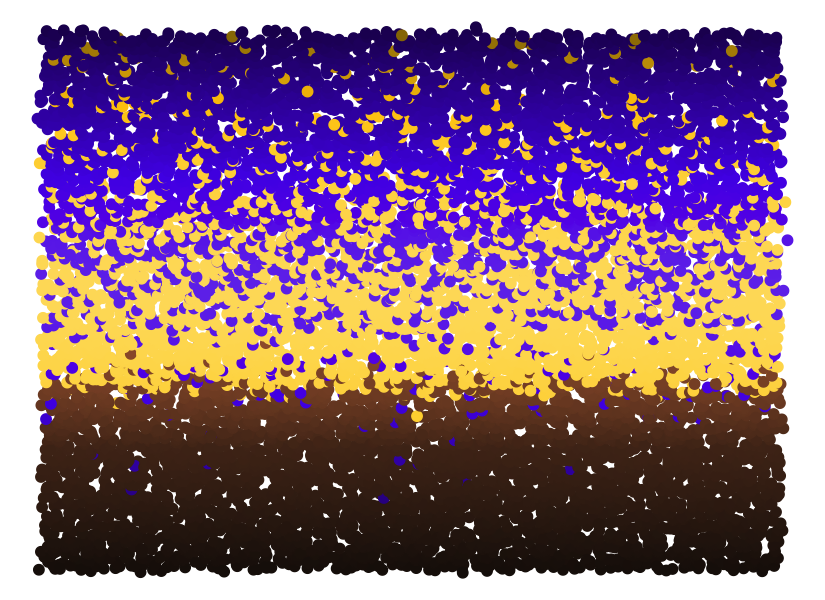
In addition to this overarching gradient, we can also apply some noise, so that neighboring points don’t have the exact same luminance. This creates additional texture.
setup_data() %>%
  mutate(
    color = darken(
      color, parabola(1 - y) + rnorm(n(), sd = 0.1), space = "HLS"
    )
  ) %>%
  paint()
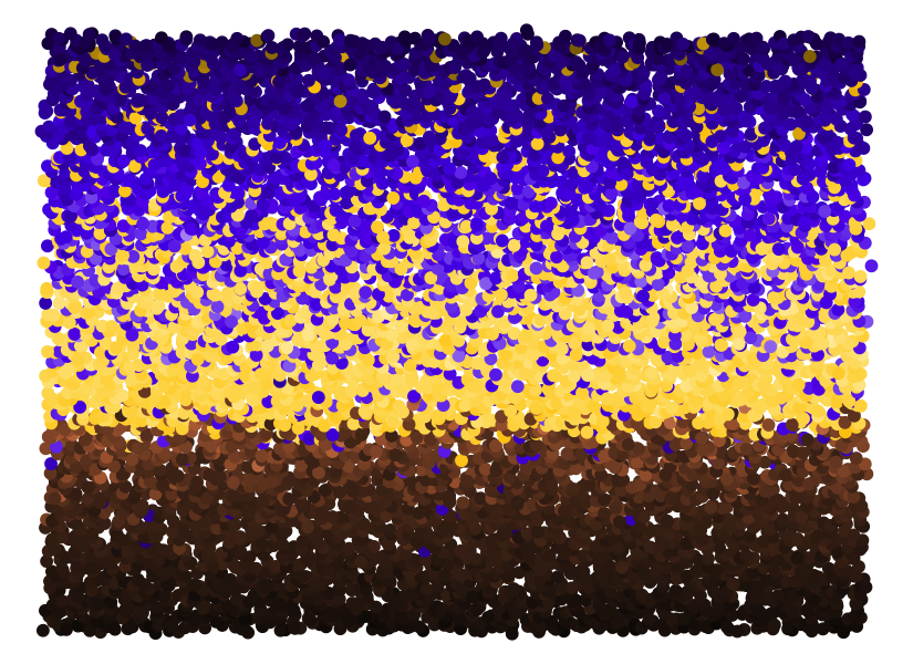
Now every individual point is slightly different, but the points
themselves are flat, without any internal structure. To create more
texture, I frequently use point shape 21, which has a separate color
and fill value (for the outline and the interior, respectively). I
then make the outline somewhat darker and the fill somewhat transparent.
We can also apply the color noise separately to the outline and the
fill. The result is the following.
paint2 <- function(data, size = 2.5, stroke = 0.3) {
  ggplot(data, aes(x, y, color = color, fill = fill)) +
    geom_point(size = size, shape = 21, stroke = stroke, alpha = 0.7) +
    scale_color_identity(aesthetics = c("color", "fill")) +
    theme_void()
}

setup_data() %>%
  mutate(
    color = darken(
      color, parabola(1 - y) + 0.3 + rnorm(n(), sd = 0.1), space = "HLS"
    ),
    fill = darken(
      color, parabola(1 - y) + rnorm(n(), sd = 0.1), space = "HLS"
    )
  ) %>%
  paint2()
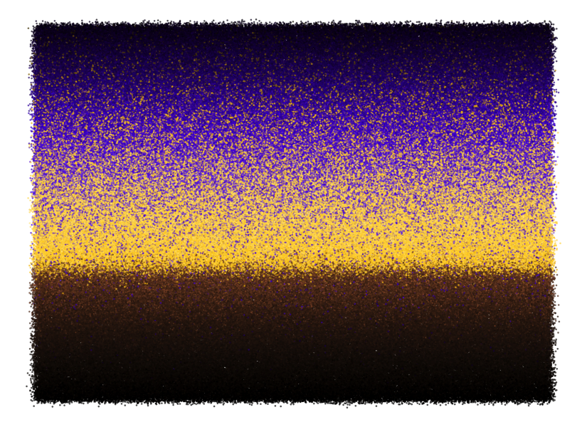
Finally, we can also increase the number of points while reducing the point size. The result is a nice grainy texture which you could use as a background for a generative artwork, or maybe as the artwork itself if you create a somewhat more interesting geometry than just horizontal stripes.
setup_data(800) %>%
  mutate(
    color = darken(
      color, parabola(1 - y) + 0.3 + rnorm(n(), sd = 0.1), space = "HLS"
    ),
    fill = darken(
      color, parabola(1 - y) + rnorm(n(), sd = 0.1), space = "HLS"
    )
  ) %>%
  paint2(size = 0.5, stroke = 0.05)