Some thoughts about colors: Color spaces
16 October 2021
Color is a complex and multifaceted topic, and it’s impossible to do it justice in a single post. Therefore, I expect this is only the first of a series of posts I will write about colors. We need to start at the beginning, and that’s what this post does. I will explain how a computer display generates colors, how a computer represents those colors, and how we can navigate the space of colors available to a modern display.
First, we need to understand the difference between additive (emissive) and subtractive color. Additive colors are generated by colored sources of light, so as we mix increasingly many colors together we get closer to white. By contrast, subtractive colors are generated by pigments that absorb light, so as we mix increasingly many colors together we get closer to black. All widely used computer displays use additive color. An example of subtractive color in a computer display would be E Ink, and while I expect that eventually this technology will play an important role in our everyday lives it doesn’t currently do so. Here I will only consider additive color.
How a computer represents color
In an additive color model, you have three primary colors, red, green, and blue. Think of them as colored lamps. If you turn on only one of the lamps you get that color. If you turn on two of them at the same time, you get one of the secondary colors yellow (red + green), cyan (green + blue), or magenta (red + blue). If you turn on all three you get white. A computer display such as an LCD or LED display consists of a grid of millions of pixels where each pixel consists of three tiny lamps, one red, one green, one blue. An image is created by selectively turning on the correct amounts of red, green, and blue for each pixel on the display.
It is standard in the industry to represent the amounts of red, green, and blue light by numbers between 0 and 255, where 0 means completely off and 255 means completely on. Thus, computers can typically display (and represent) 256 x 256 x 256 = 16.7 million colors. A compact way of writing colors is in hexadecimal, where the first two digits represent the amount of red, the next two digits represent the amount of green, and the final two digits represent the amount of blue light present in the color. See the following table for a few examples of amounts of red (R), green (G), and blue (B) light, the corresponding hex code, and the color that is output.

The set of all possible colors represented by their R, G, and B values is called the RGB color space. The space has the shape of a cube in 3D space, and we can visualize it by plotting slices through the cube.

It may not be immediately obvious to you, but this image contains virtually every color your screen can display (with the caveat that we’re making fairly large steps in the blue component). You can probably easily locate the primary colors red, green, blue, the secondary colors yellow, cyan, magenta, and the extremes black and white. But every other color is there, and with enough patience and care you could find it. Nevertheless, the RGB color space tends to be unintuitive for most people. For example, was it clear to you that mixing red and green makes yellow? You may remember from school that green is not a primary color and that instead you get it by mixing blue and yellow. This is correct in a subtractive color model, e.g. if you’re painting with water colors, but it’s not true in the RGB space. In RGB, blue plus yellow makes white.
How we think about color
Let’s step back and consider how we think about color. If we don’t think about amounts of red, green, and blue light, what do we think about? First, most people will have a sense of hue, which in everyday language we’d simply refer to as the color. The hue tells us whether a color is red or green or blue etc. Leaving aside issues of color-vision deficiency, most people can distinguish and name hues.
Next, we can think about the colorfulness of a color. You may not previously have thought about this dimension, but it will make sense once you think about the extremes. On the one extreme is gray. It has no color at all, so colorfulness is minimal. On the other extreme is a very strong color, such as a tomato red. It has high colorfulness. Now imagine all possible intermediate values. You might transition from a full gray to a gray with a shade of red to increasingly less gray until you reach tomato red. This is the dimension of colorfulness. We also refer to it as the chroma of a color.
Finally, we can think about the lightness or darkness of a color. White is maximally light, and black is maximally dark. All other colors are somewhere in the middle. A bright yellow is a light color, whereas a navy blue is a dark color.
Once we have articulated these dimensions, we can imagine taking a color and changing it separately along each. The following example demonstrates this, starting from a purple.

Now that you have a concept of these three dimensions, go back to the image of the RGB color space and think about what you see there. First, you may appreciate how difficult it will be to navigate the space trying to find a particular hue. Different hues are found in different corners of the color cube, and going from one hue to another may require a somewhat nontrivial path through this space. Second, you may notice that almost all colors are very colorful (have a lot of chroma). You may think this is a trivial point, since I’m actually showing all colors the RGB space can represent. However, it’s very important. When you are working in RGB you are likely to pick colors with a lot of chroma, because they are easy to discover, whereas less colorful colors are much more difficult to locate. This is a problem, because high chroma can make colors look jarring, unpleasant, or toy-like.
The HSV, HLS, and HCL color spaces
So let’s think about some other ways in which we can represent colors. These different representations are all referred to as color spaces, and each color space is a one-to-one mapping from the RGB coordinates to different coordinates that hopefully make it easier to reason about colors.
First, let’s consider HSV, which stands for hue–saturation–value. This popular color space separates out the hue from two other components which jointly represent the lightness and the colorfulness of a color. Hue is an angle, and it runs from 0 to 360. Saturation is a number between 0 and 1 indicating the colorfulness relative to the brightness of the color. Value is also a number between 0 and 1, and it represents the subjective perception of amount of light emitted. The HSV color space looks as follows:

We can immediately see one positive aspect of this color space: The hue is fully decoupled from the other two coordinates. Once we have found a hue that we like, we can independently change the saturation and value until we have the desired lightness and colorfulness. However, HSV has at least three problems: 1. Most colors we can find easily are either very colorful or very dark. 2. To change the colorfulness of a color without making it lighter or darker we need to take a diagonal path where we jointly adjust both S and V. 3. If we change the hue of a color, we will typically end up with a new color that is quite a bit lighter or darker than the old color. As an example, compare the colors near S = 1 and V = 1 for H = 60 (a bright yellow) and H = 240 (a dark blue).
A small modification of HSV yields HLS, hue–lightness–saturation. Hue and saturation have the same meaning as in HSV, but instead of value V we now have lightness L (again a number between 0 and 1), which indicates the brightness of the color relative to the brightness of a similarly illuminated white.

We can see that in HLS, lightness smoothly transitions from black at L = 0 to white at L = 1, regardless of the H or S value, and similarly, saturation smoothly transitions from gray at S = 0 to maximally colorful at S = 1, regardless of the H or V value. We can also see that the very colorful colors now take up a much smaller region of the total color space. They are located in areas with saturation in excess of 0.5 and with intermediate lightness, near 0.5.
While HLS is a useful color space for many applications, it still has a major shortcoming: When we change the hue of a color, we also change the perceived lightness of the color, just as was the case with HSV. Again, compare, for example, H = 60 (yellow) to H = 240 (blue) and note how the yellows overall look much lighter than the blues.
This leads us to the last color space we will discuss, HCL (hue–chroma–luminance). The hue component serves the same purpose as in HSV and HLS, though the exact mapping from a number between 0 and 360 to a specific color is somewhat different. The luminance component L measures the amount of light emitted and runs from 0 to 100, where 0 is black (no light emitted) and 100 is white (maximum amount of light emitted). The chroma component C measures the absolute colorfulness and typically lies between 0 and about 75 but can run as high as 180.

You can see one immediate and important difference here between the HCL space and all previous spaces we have considered: The HCL space has a strange shape. For all the other color spaces, we can pick any combination of the three parameters (red, green, blue, or hue, saturation, value, etc) and the result is a valid color. By contrast, in the HCL space there are parameter regions where colors simply don’t exist. For example, at a hue of 90 (yellow), you can pick a color with a chroma of 100 and a luminance of 96, but colors with these chroma and luminance levels do not exist for other hues, such as 240 (blue). There is simply no blue that has that much chroma and luminance. Yellow colors tend to be bright and blue colors tend to be dark, and so we cannot necessarily create a blue with the same chroma and luminance as a yellow and vice versa.
However, in the HCL color space we can change the hue of a color without affecting the perceived lightness or colorfulness. This property is useful in many applications. For example, the default categorical color scale in ggplot takes equidistant steps in hue while keeping chroma and luminance constant. This results in a set of colors that are very balanced. No single color stands out.

Conclusions
So the upside of the HCL space is that the three dimensions humans care about (the hue of the color, how gray or colorful a color is, how light or dark it is) are perfectly decoupled from one-another and can be adjusted independently. The downside is that you end up with a strangely-shaped object that cannot be represented as a simple cube. I believe the strange shape of the HCL space has limited adoption. It tends to confuse people that encounter it for the first time, and it also makes it more challenging for developers of image manipulation or drawing software to implement a color chooser dialog. Nevertheless, it’s very much worth the effort to get to know the space, and I personally use it every day.
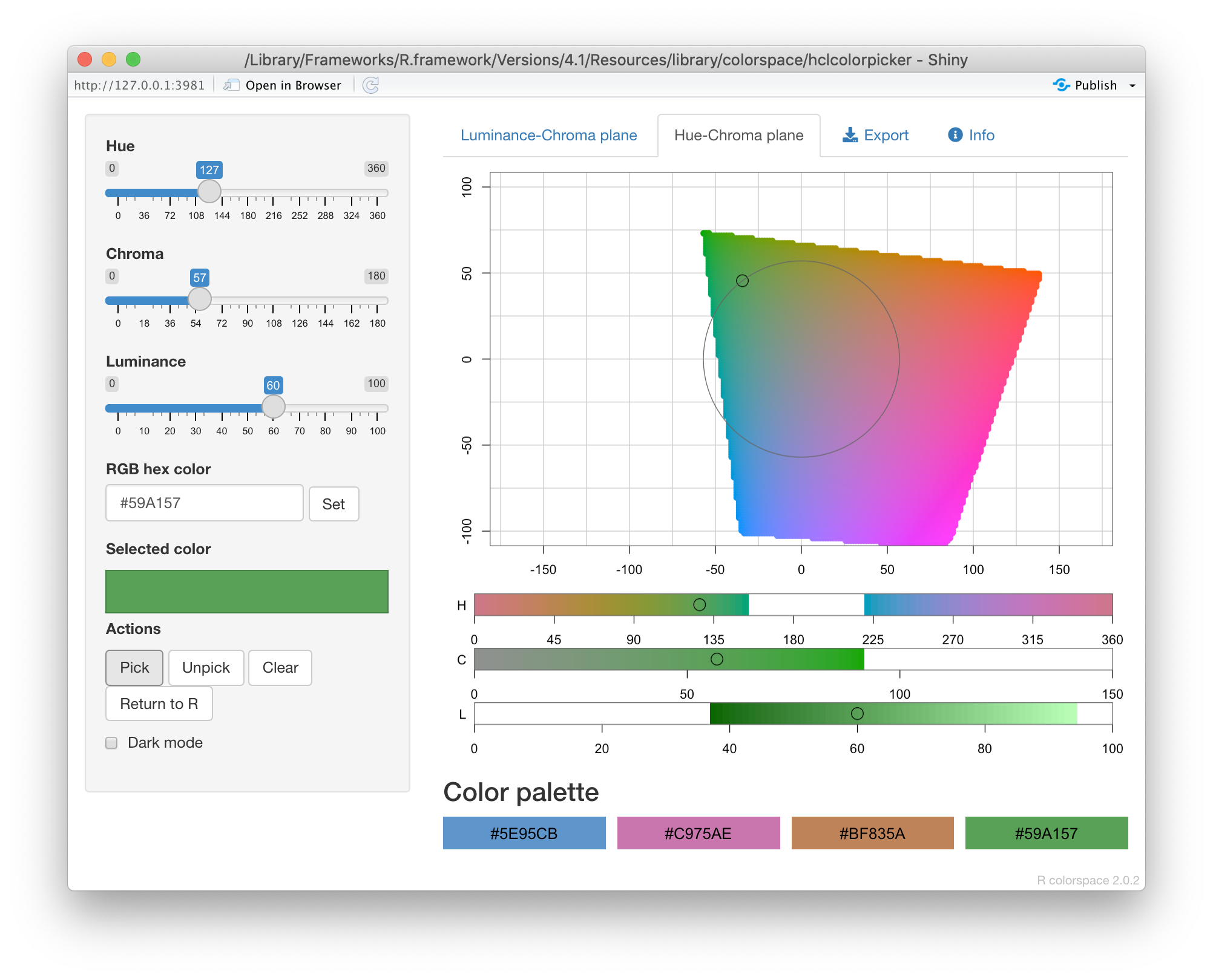
How can you explore the HCL space interactively? Unfortunately, many
drawing and painting apps still don’t support it. If you are an R user,
the colorspace package provides you with an interactive app
(colorspace::choose_color()) where you can choose colors in HCL space.
I originally wrote this app because I was frustrated with the lack of
HCL support in software I had access to. I have recently noticed though
that the free image manipulation software GIMP now provides HCL sliders
alongside RGB sliders in its color chooser dialog. But one major
advantage of the R app is that you can make the window as large as you
want, and this really helps with exploring colors.
Finally, I want to emphasize that even though HCL is my preferred color space, it is important to be familiar with and explore other color spaces also. Different color spaces may be advantageous in certain applications. In my experience, HLS makes it easier to locate bright, vivid colors whereas HCL makes it easier to locate more subdued, pastel-like colors. Depending on what you are looking for, either colorspace may work better for you. Regardless of which color space you use, however, I encourage you to think in terms of hue, colorfulness, and lightness/darkness of a color. This mental framework will definitely help you make better color choices.
This series continues with a post about chroma.