Using t-SNE for generative art
10 October 2021
In non-linear dimension reduction, a widely used algorithm is t-distributed stochastic neighbor embedding (t-SNE). Its stated purpose is to find structure in high-dimensional datasets and to represent this structure in a low-dimensional embedding. While t-SNE is widely popular in genomics and other “big data” research fields, to my knowledge it is not commonly used for generative art. I think that’s a shame, because t-SNE can produce beautiful, strand-like arrangements of dots. I had noticed this effect in early 2021, while preparing a class on non-linear dimension reduction. I wanted to show how t-SNE deformed a simple input data set with known structure, and I found that the resulting output tended to be somewhat mysterious and unpredictable, but always intriguing. More recently, Chari et al. have performed a systematic analysis of t-SNE’s properties and have argued that it is not suitable for reliable data analysis. All it does is produce art.
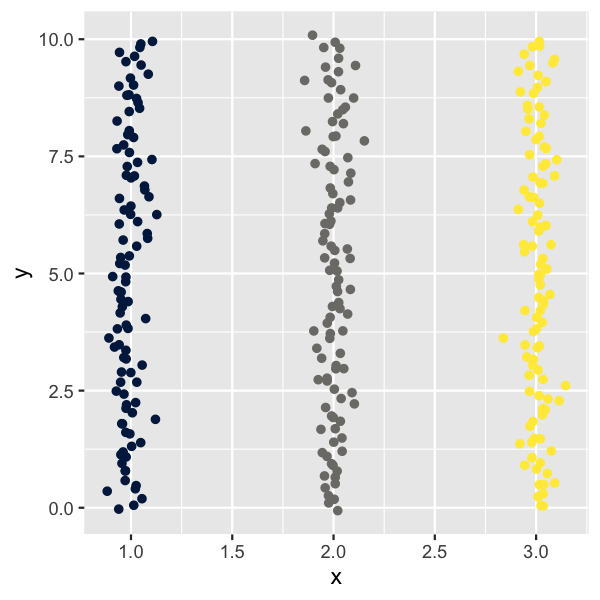
Here I want to demonstrate the basic principles of how we can use the t-SNE algorithm to create some intricate, organically looking patterns. Let’s start by creating a few vertical stripes of points.
library(tidyverse)

setup_coords <- function(groups = 3, n = 100, sd = .05) {
  tibble(
    x = rep(1:groups, each = n) + rnorm(groups*n, sd = sd),
    y = rep(seq(from = 0, to = 10, length.out = n), groups) +
          rnorm(groups*n, sd = sd),
    group = rep(letters[1:groups], each = n)
  )
}

setup_coords() %>%
  ggplot(aes(x, y, color = group)) +
  geom_point() +
  scale_color_viridis_d(option = "E", guide = "none")
Next we simply run the t-SNE algorithm over this dataset and then plot in t-SNE coordinates but color by original stripe identity.
library(Rtsne)

do_tsne <- function(coords, perplexity = 5) {
  tsne_fit <- coords %>%
    select(x, y) %>%
    scale() %>%
    Rtsne(perplexity = perplexity, max_iter = 500, check_duplicates = FALSE)

    tsne_fit$Y %>%
      as.data.frame() %>%
      cbind(select(coords, -x, -y))
}

setup_coords() %>%
  do_tsne() %>%
  ggplot(aes(V1, V2, color = group)) +
  geom_point() +
  scale_color_viridis_d(option = "E", guide = "none") +
  coord_fixed() + theme_void()
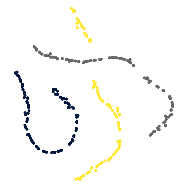
We see that t-SNE tends to keep points belonging to the same original stripe close to each other, but lays them out in meandering paths. Also, it frequently causes some paths to get interrupted by other paths.
Let’s play around with some of the parameters and see what we get. To
make this as efficient as possible, we define a function
make_tsne_plot() that takes a few key parameters and returns the
corresponding plot as result. As a first try, we use five distinct input
stripes, and we remove all noise from the stripes.
make_tsne_plot <- function(groups = 5, n = 200, sd = 0, perplexity = 5) {
  setup_coords(groups = groups, n = n, sd = sd) %>%
    do_tsne(perplexity) %>%
    ggplot(aes(V1, V2, color = group)) +
    geom_point() +
    scale_color_viridis_d(option = "E", guide = "none") +
    coord_fixed() + theme_void() +
    theme(
      plot.margin = margin(20, 20, 20, 20),
      panel.border = element_rect(color = "black", fill = NA)
    )
}

make_tsne_plot(groups = 5, sd = 0)
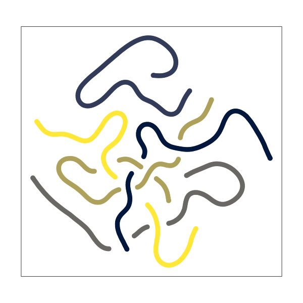
The result is a set of very smooth, connected paths that meander around and intersect each other.
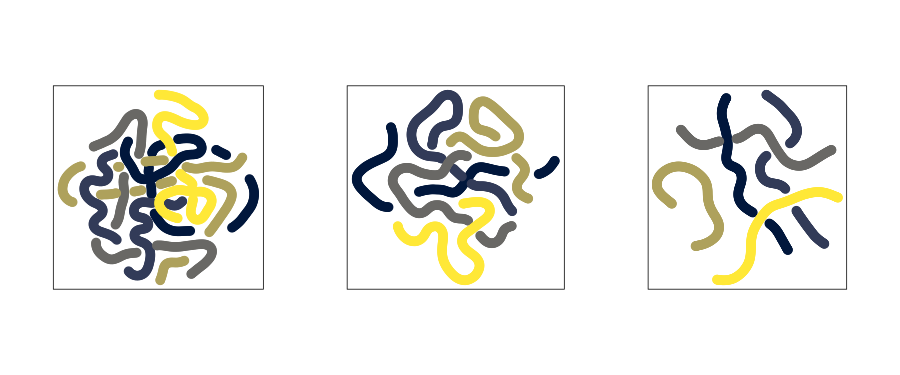
We can influence the amount of intersection by modifying the perplexity parameter. Higher perplexity means fewer intersections.
library(patchwork)

make_tsne_plot(groups = 5, sd = 0, perplexity = 2) |
  make_tsne_plot(groups = 5, sd = 0, perplexity = 5) |
  make_tsne_plot(groups = 5, sd = 0, perplexity = 12)
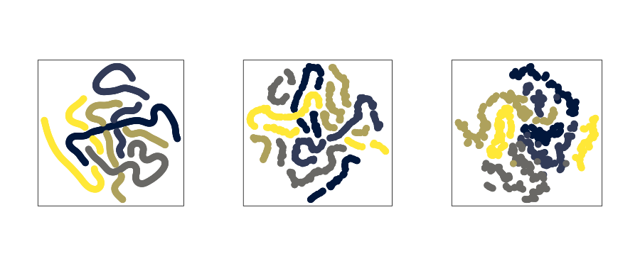
Similarly, we can influence the smoothness of the paths by changing the amount of noise applied to the input data. The more noise the more irregular the paths become.
make_tsne_plot(groups = 5, sd = 0) |
  make_tsne_plot(groups = 5, sd = 0.05) |
  make_tsne_plot(groups = 5, sd = 0.2)
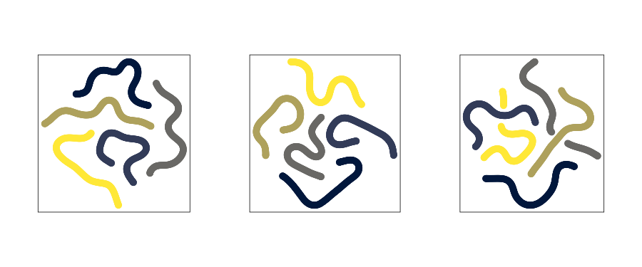
The results of t-SNE depend on the random seed, so if we simply generate the same plot multiple times we get different results.
make_tsne_plot(groups = 5, sd = 0, perplexity = 12) |
  make_tsne_plot(groups = 5, sd = 0, perplexity = 12) |
  make_tsne_plot(groups = 5, sd = 0, perplexity = 12)
These are the core concepts I used in my t-SNE series. Everything else is just choice of colors and point sizes as well as specific parameter choices for the input data and t-SNE computation.
If you use these concepts in your own work, please let me know. I’m looking forward to seeing what you come up with!