Effective Visual Communication
2025-03-27
How did I get here?
![]()
Every story needs an arc
Opening
![]()
Challenge
![]()
Action
![]()
Resolution
Every story needs an arc
Opening
![]()
Challenge
![]()
Action
![]()
Resolution
Challenge and resolution are
the two most important parts
Other story structures
Action
![]()
Background
![]()
Development
![]()
Climax
![]()
Ending
(Better for action movies
than for scientific reports)
Other story structures
Lead
![]()
Development
(Commonly used in newspaper articles)
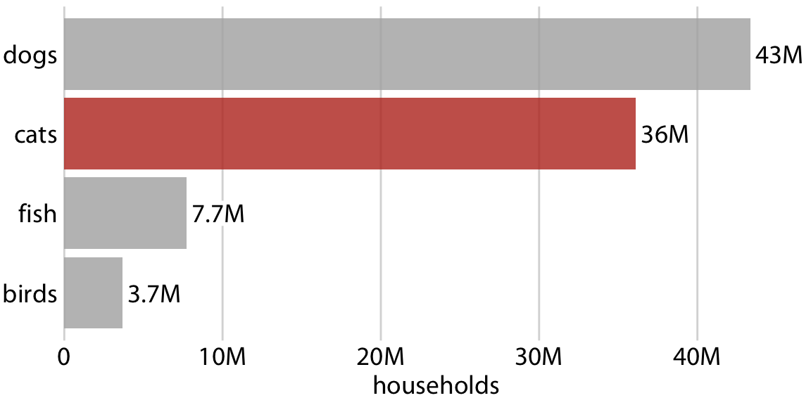
Focus on the specific message you want to convey

American and Delta have the shortest delays
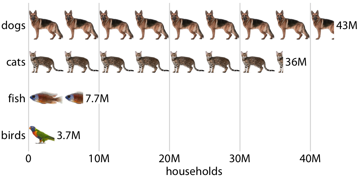
Make your figures memorable
Make your figures memorable
Example: Preprints in biology

Opening
Example: Preprints in biology

What happened in 2014 to curtail the growth?
Challenge
Example: Preprints in biology

bioRxiv opened in 2014
Resolution
Don’t use tiny fonts!
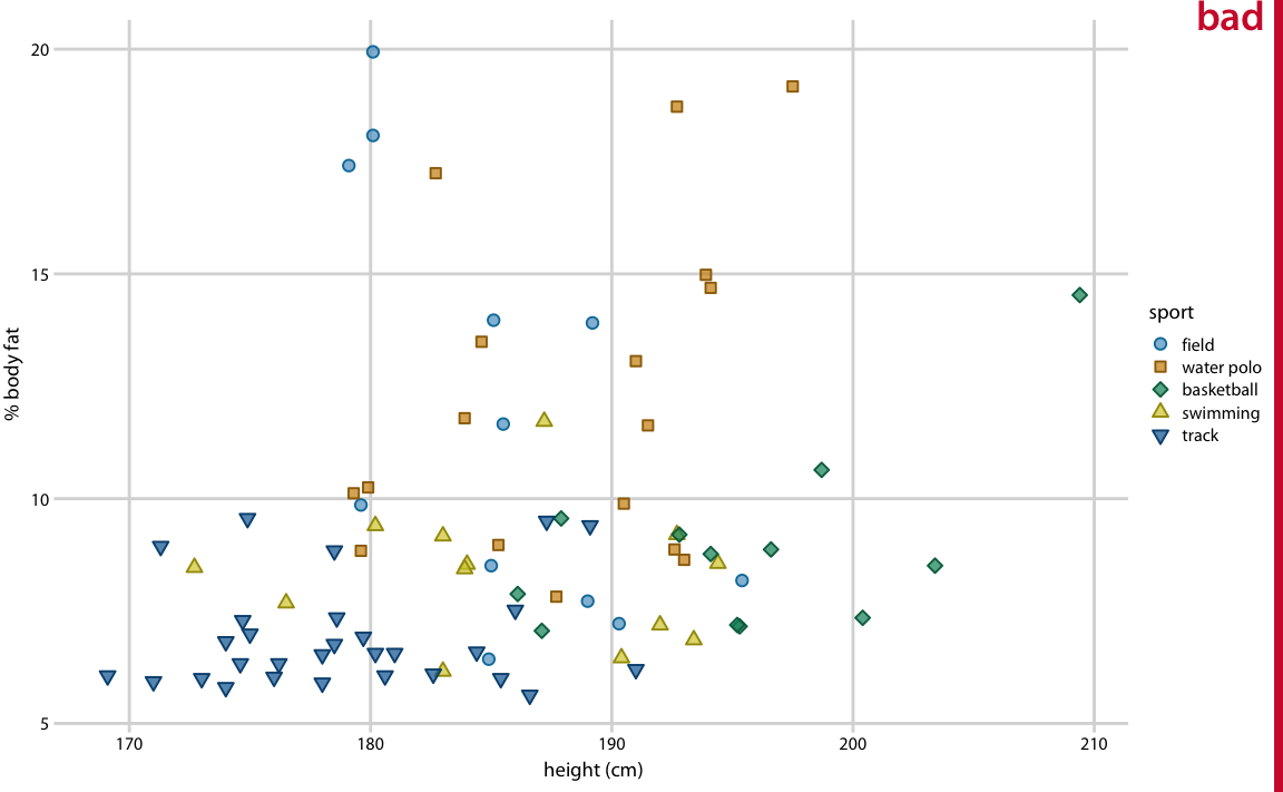
Both text and symbols are way too small
Don’t use tiny fonts!
Text and symbols are reasonable but could be bigger
Don’t use tiny fonts!
Symbols too small compared to text
Don’t use tiny fonts!
Make fonts bigger than you feel comfortable
Don’t use tiny fonts!
Make fonts bigger than you feel comfortable
Be aware of color-vision deficiency
5%–8% of men are color blind!
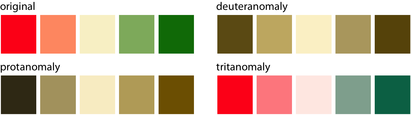
Red-green color-vision deficiency is the most common
Be aware of color-vision deficiency
5%–8% of men are color blind!
Blue-yellow color-vision deficiency is rarer but does occur; it is more common in older people
Be aware of color-vision deficiency
Choose colors that can be distinguished with CVD
Consider using the Okabe-Ito scale
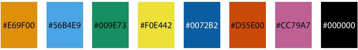
| Name | Hex code | R, G, B (0-255) |
|---|---|---|
| orange | #E69F00 | 230, 159, 0 |
| sky blue | #56B4E9 | 86, 180, 233 |
| bluish green | #009E73 | 0, 158, 115 |
| yellow | #F0E442 | 240, 228, 66 |
| blue | #0072B2 | 0, 114, 178 |
| vermilion | #D55E00 | 213, 94, 0 |
| reddish purple | #CC79A7 | 204, 121, 167 |
| black | #000000 | 0, 0, 0 |
CVD is worse for thin lines and tiny dots
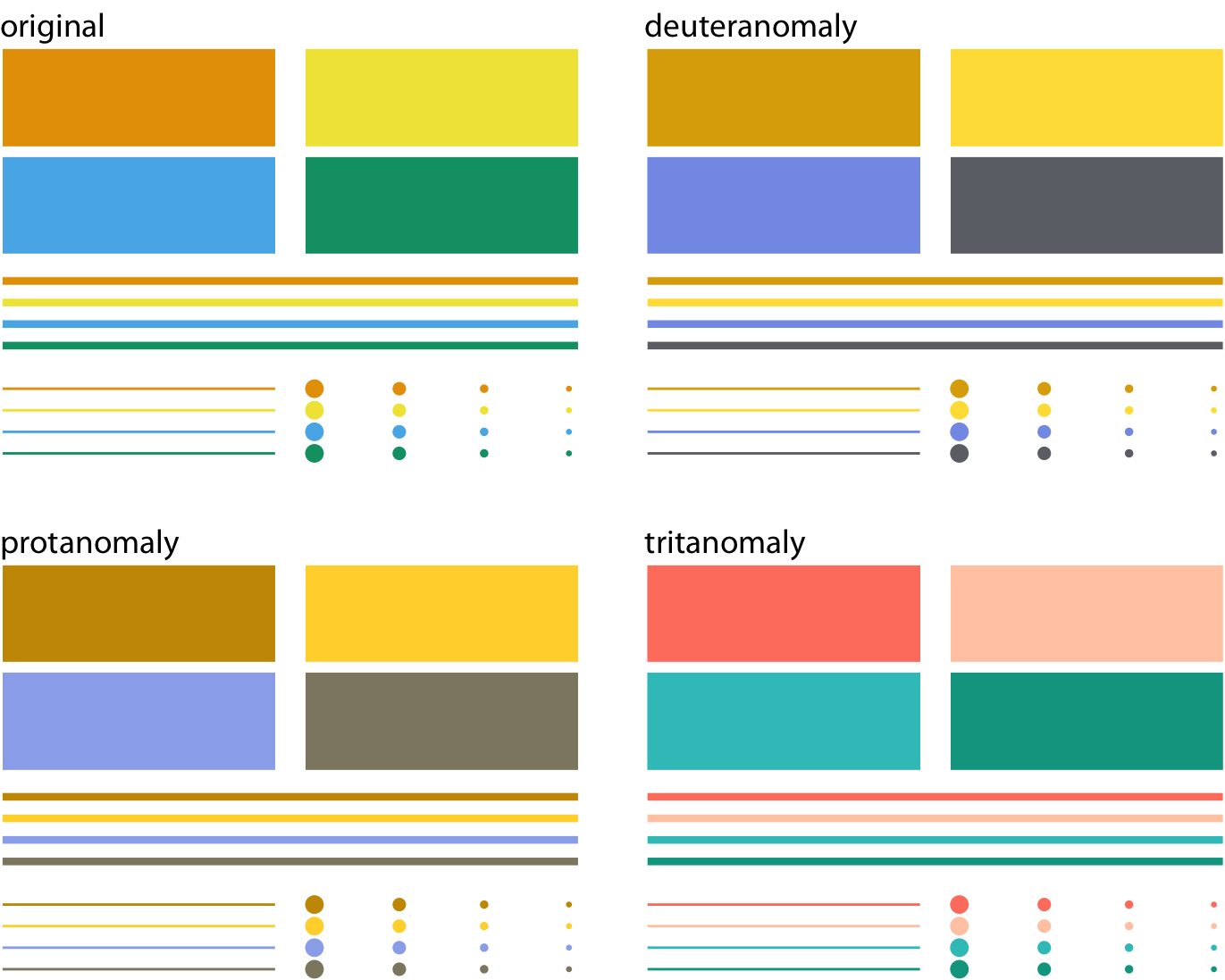
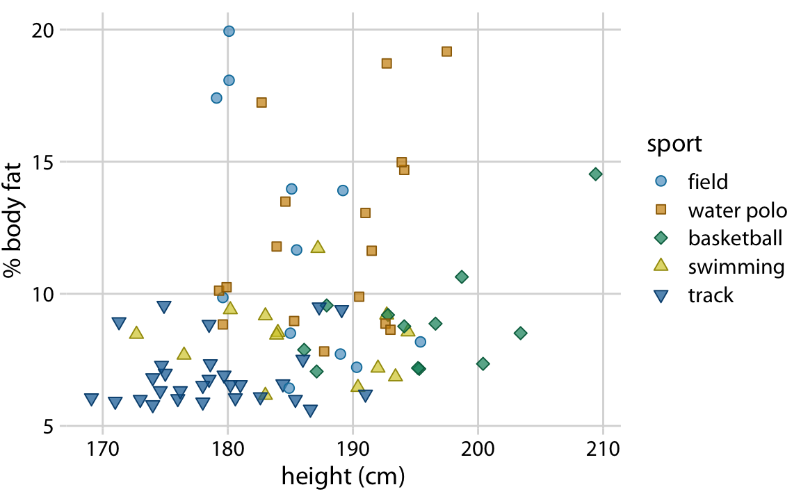
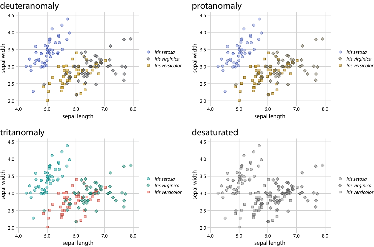
Color encoding alone is not always sufficient
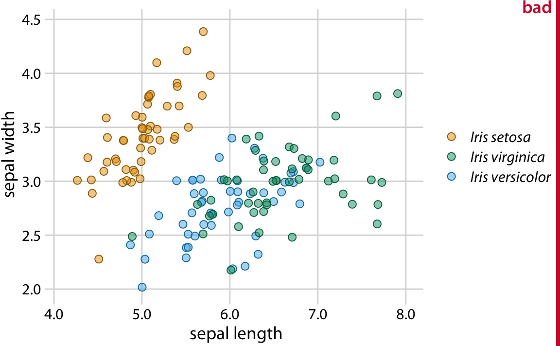
Iris virginica and Iris versicolor are difficult to tell apart
Rearranging colors and using different shapes helps
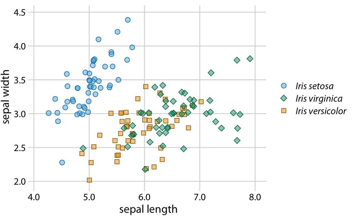
Orange provides much better contrast next to green
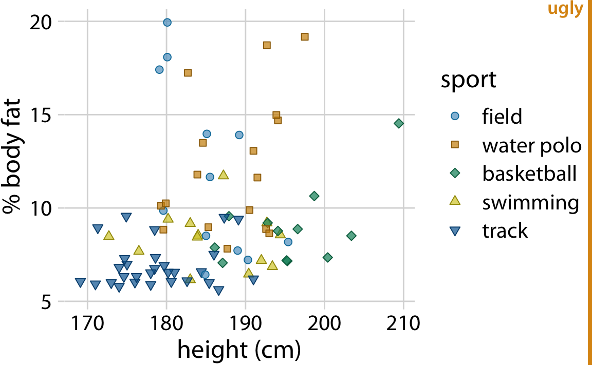
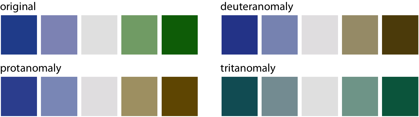
When in doubt, run CVD simulations
Original
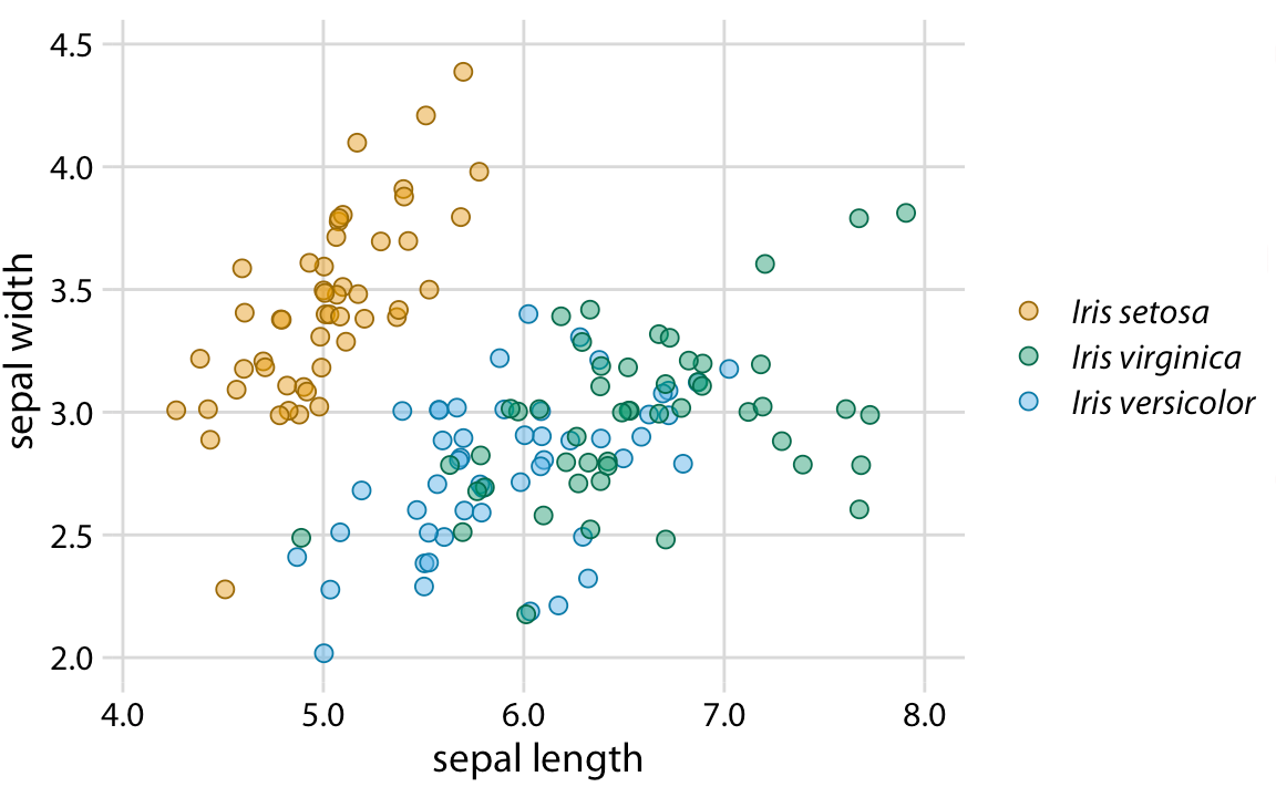
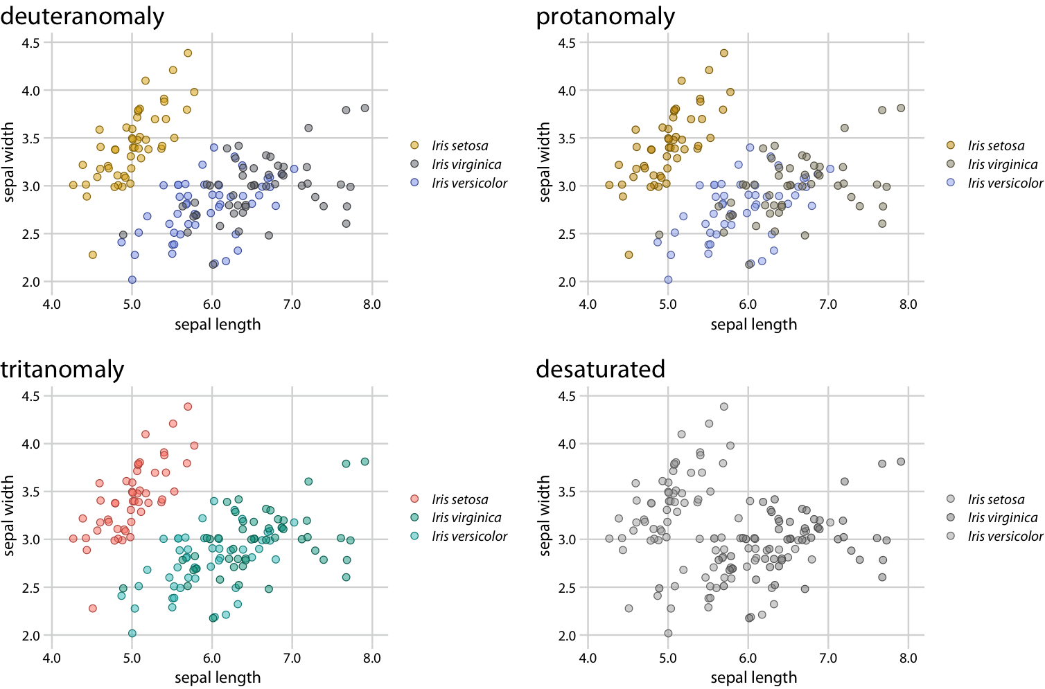
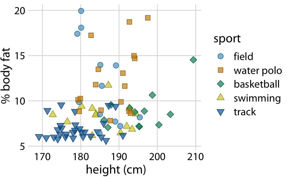
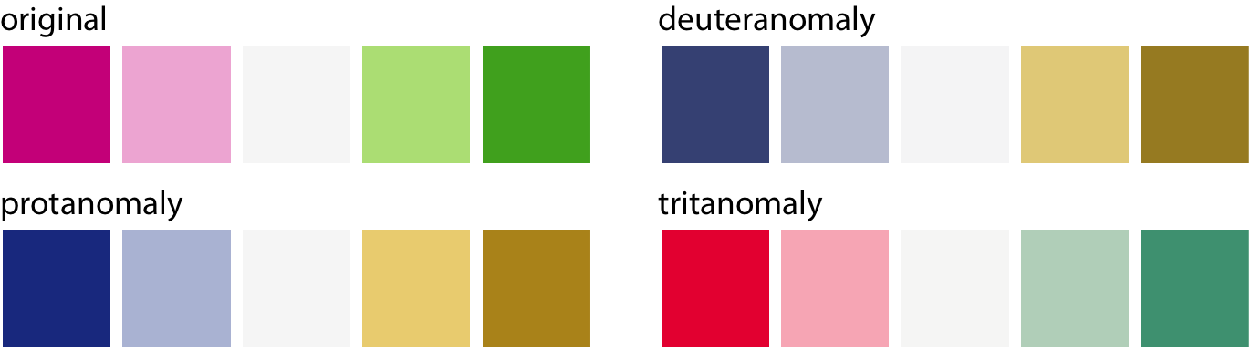
When in doubt, run CVD simulations
Original
Pay attention to legend order

Legend order does not match visual order of the lines
Pay attention to legend order

Legend order does match visual order of the lines
Even better: Don’t use a legend at all

This technique is called “direct labeling”
Additional materials, examples with R code