29 Telling a story and making a point
Most data visualization is done for the purpose of communication. We have an insight about a dataset, and we have a potential audience, and we would like to convey our insight to our audience. To communicate our insight successfully, we will have to present the audience with a clear and exciting story. The need for a story may seem disturbing to scientists and engineers, who may equate it with making things up, putting a spin on things, or overselling results. However, this perspective misses the important role that stories play in reasoning and memory. We get excited when we hear a good story, and we get bored when the story is bad or when there is none. Moreover, any communication creates a story in the audience’s minds. If we don’t provide a clear story ourselves, then our audience will make one up. In the best-case scenario, the story they make up is reasonably close to our own view of the material presented. However, it can be and often is much worse. The made-up story could be “this is boring,” “the author is wrong,” or “the author is incompetent.”
Your goal in telling a story should be to use facts and logical reasoning to get your audience interested and excited. Let me tell you a story about the theoretical physicist Stephen Hawking. He was diagnosed with motor neuron disease at age 21—one year into his PhD—and was given two years to live. Hawking did not accept this predicament and started pouring all his energy into doing science. Hawking ended up living to be 76, became one of the most influential physicists of his time, and did all of his seminal work while being severely disabled. I’d argue that this is a compelling story. It’s also entirely fact-based and true.
29.1 What is a story?
Before we can discuss strategies for turning visualizations into stories, we need to understand what a story actually is. A story is a set of observations, facts, or events, true or invented, that are presented in a specific order such that they create an emotional reaction in the audience. The emotional reaction is created through the build-up of tension at the beginning of the story followed by some type of resolution towards the end of the story. We refer to the flow from tension to resolution also as the story arc, and every good story has a clear, identifiable arc.
Experienced writers know that there are standard patterns for storytelling that resonate with how humans think. For example, we can tell a story using the Opening–Challenge–Action–Resolution format. In fact, this is the format I used for the Hawking story in the previous subsection. I opened the story by introducing the topic, the physicist Stephen Hawking. Next I presented the challenge, the diagnosis of motor neuron disease at age 21. Then came the action, his fierce dedication to science. Finally I presented the resolution, that Hawking led a long and successful life and ended up becoming one of the most influential physicists of his time. Other story formats are also commonly used. Newspaper articles frequently follow the Lead–Development–Resolution format or, even shorter, just Lead–Development, where the lead gives away the main point up front and the subsequent material provides further details. If we wanted to tell the Hawking story in this format, we might start out with a sentence such as “The influential physicist Stephen Hawking, who revolutionized our understanding of black holes and of cosmology, outlived his doctors’ prognosis by 53 years and did all of his most influential work while being severely disabled.” This is the lead. In the development, we could follow up with a more in-depth description of Hawking’s life, illness, and devotion to science. Yet another format is Action–Background–Development–Climax–Ending, which develops the story a little more rapidly than Opening–Challenge–Action–Resolution but not as rapidly as Lead–Development. In this format, we might open with a sentence such as “The young Stephen Hawking, facing a debilitating disability and the prospect of an early death, decided to pour all his efforts into his science, determined to make his mark while he still could.” The purpose of this format is to draw in the audience and to create an emotional connection early on, but without immediately giving away the final resolution.
My goal in this chapter is not to describe these standard forms of story telling in more detail. There are excellent resources that cover this material. For scientists and analysts, I particularly recommend Schimel (2011). Instead, I want to discuss how we can bring data visualizations into the story arc. Most importantly, we need to realize that a single (static) visualization will rarely tell an entire story. A visualization may illustrate the opening, the challenge, the action, or the resolution, but it is unlikely to convey all these parts of the story at once. To tell a complete story, we will usually need multiple visualizations. For example, when giving a presentation, we may first show some background or motivational material, then a figure that creates a challenge, and eventually some other figure that provides the resolution. Likewise, in a research paper, we may present a sequence of figures that jointly create a convincing story arc. It is, however, also possible to condense an entire story arc into a single figure. Such a figure must contain a challenge and a resolution at the same time, and it is comparable to a story arc that starts with a lead.
To provide a concrete example of incorporating figures into stories, I will now tell a story on the basis of two figures. The first creates the challenge and the second serves as the resolution. The context of my story is the growth of preprints in the biological sciences (see also Chapter 13). Preprints are manuscripts in draft form that scientists share with their colleagues before formal peer review and official publication. Scientists have been sharing manuscript drafts for as long as scientific manuscripts have existed. However, in the early 1990s, with the advent of the internet, physicists realized that it was much more efficient to store and distribute manuscript drafts in a central repository. They invented the preprint server, a web server where scientists can upload, download, and search for manuscript drafts.
The preprint server physicists developed and still use today is called arXiv.org. Shortly after it was established, arXiv.org started to branch out and become popular in related quantitative fields, including mathematics, astronomy, computer science, statistics, quantitative finance, and quantitative biology. Here, I am interested in the preprint submissions to the quantitative biology (q-bio) section of arXiv.org. The number of submissions per month grew exponentially from 2007 to late 2013, but then the growth suddenly stopped (Figure 29.1). Something must have happened in late 2013 that radically changed the landscape in preprint submissions for quantitative biology. What caused this drastic change in submission growth?
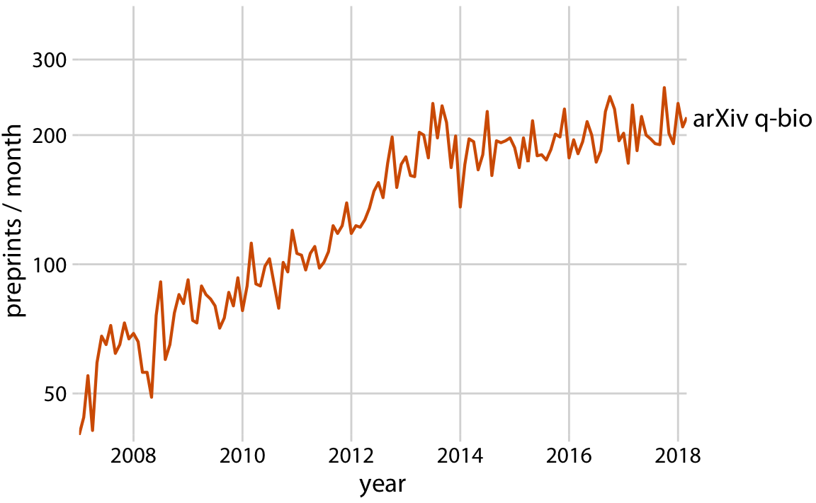
Figure 29.1: Growth in monthly submissions to the quantitative biology (q-bio) section of the preprint server arXiv.org. A sharp transition in the rate of growth can be seen around 2014. While growth was rapid up to 2014, almost no growth occurred from 2014 to 2018. Note that the y axis is logarithmic, so a linear increase in y corresponds to exponential growth in preprint submissions. Data source: Jordan Anaya, http://www.prepubmed.org/
I will argue that late 2013 marks the point in time when preprints took off in biology, and ironically this caused the q-bio archive to slow its growth. In November 2013, the biology-specific preprint server bioRxiv was launched by Cold Spring Harbor Laboratory (CSHL) Press. CSHL Press is a publisher that is highly respected among biologists. The backing of CSHL Press helped tremendously with the acceptance of preprints in general and bioRxiv in particular among biologists. The same biologists that would have been quite suspicious of arXiv.org were much more comfortable with bioRxiv. As a result bioRxiv quickly gained acceptance among biologists, to a degree that arXiv had never managed. In fact, soon after its launch, bioRxiv started experiencing rapid, exponential growth in monthly submissions, and the slowdown in q-bio submissions exactly coincides with the start of this exponential growth in bioRxiv (Figure 29.2). It appears to be the case that many quantitative biologists who otherwise might have deposited a preprint with q-bio decided to deposit it with bioRxiv instead.
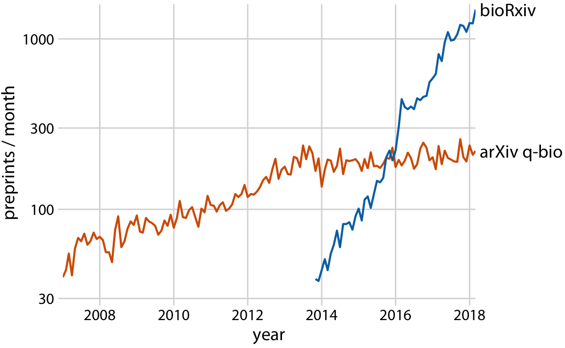
Figure 29.2: The leveling off of submission growth to q-bio coincided with the introduction of the bioRxiv server. Shown are the growth in monthly submissions to the q-bio section of the general-purpose preprint server arxiv.org and to the dedicated biology preprint server bioRxiv. The bioRxiv server went live in November 2013, and its submission rate has grown exponentially since. It seems likely that many scientists who otherwise would have submitted preprints to q-bio chose to submit to bioRxiv instead. Data source: Jordan Anaya, http://www.prepubmed.org/
This is my story about preprints in biology. I purposefully told it with two figures, even though the first (Figure 29.1) is fully contained within the second (Figure 29.2). I think this story has the strongest impact when broken into two pieces, and this is how I would present it in a talk. However, Figure 29.2 alone can be used to tell the entire story, and the single-figure version might be more suitable to a medium where the audience can be expected to have short attention span, such as in a social media post.
29.2 Make a figure for the generals
For the remainder of this chapter, I will discuss strategies for making individual figures and sets of figures that help your audience to connect with your story and remain engaged throughout your entire story arc. First, and most importantly, you need to show your audience figures they can actually understand. It is entirely possible to follow all the recommendations I have provided throughout this book and still prepare figures that confuse. When this happens, you may have fallen victim to two common misconceptions; first, that the audience can see your figures and immediately infer the points you are trying to make; second, that the audience can rapidly process complex visualizations and understand the key trends and relationships that are shown. Neither of these assumptions is true. We need to do everything we can to help our readers understand the meaning of our visualizations and see the same patterns in the data that we see. This usually means less is more. Simplify your figures as much as possible. Remove all features that are tangential to your story. Only the important points should remain. I refer to this concept as “making a figure for the generals.”
For several years, I was in charge of a large research project funded by the U.S. Army. For our annual progress reports, I was instructed by the program managers to not include a lot of figures. And any figure I did include should show very clearly how our project was succeeding. A general, the program managers told me, should be able to look at each figure and immediately see how what we were doing was improving upon or exceeding prior capabilities. Yet when my colleagues who were part of this project sent me figures for the annual progress report, many of the figures did not meet this criterion. The figures usually were overly complex, were labeled in confusing, technical terms, or did not make any obvious point at all. Most scientists are not trained to make figures for the generals.
Never assume your audience can rapidly process complex visual displays.
Some might hear this story and conclude that the generals are not very smart or just not that into science. I think that’s exactly the wrong take-home message. The generals are simply very busy. They can’t spend 30 minutes trying to decipher a cryptic figure. When they give millions of dollars of taxpayer funds to scientists to do basic research, the least they can expect in return is a handful of clear demonstrations that something worthwhile and interesting was accomplished. This story should also not be misconstrued as being about military funding in particular. The generals are a metaphor for anybody you may want to reach with your visualization. It can be a scientific reviewer for your paper or grant proposal, it can be a newspaper editor, or it can be your supervisor or your supervisor’s boss at the company you’re working. If you want your story to come across, you need to make figures that are appropriate for all these generals.
The first thing that will get in the way of making a figure for the generals is, ironically, the ease with which modern visualization software allows us to make sophisticated data visualizations. With nearly limitless power of visualization, it becomes tempting to keep piling on more dimensions of data. And in fact, I see a trend in the world of data visualization to make the most complex, multi-faceted visualizations possible. These visualizations may look very impressive, but they are unlikely to convey a clear story. Consider Figure 29.3, which shows the arrival delays for all flights departing out of the New York City area in 2013. I suspect it will take you a while to process this figure.
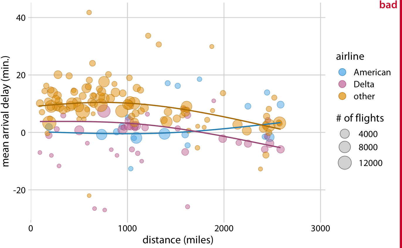
Figure 29.3: Mean arrival delay versus distance from New York City. Each point represents one destination, and the size of each point represents the number of flights from one of the three major New York City airports (Newark, JFK, or LaGuardia) to that destination in 2013. Negative delays imply that the flight arrived early. Solid lines represent the mean trends between arrival delay and distance. Delta has consistently lower arrival delays than other airlines, regardless of distance traveled. American has among the lowest delays, on average, for short distances, but has among the highest delays for longer distances traveled. This figure is labeled as “bad” because it is overly complex. Most readers will find it confusing and will not intuitively grasp what it is the figure is showing. Data source: U.S. Dept. of Transportation, Bureau of Transportation Statistics.
I think the most important feature of Figure 29.3 is that American and Delta have the shortest arrival delays. This insight is much better conveyed in a simple bar graph (Figure 29.4). Therefore, Figure 29.4 is the correct figure to show if the story is about arrival delays of airlines, even if making that graph doesn’t challenge your data visualization skills. And if you’re then wondering whether these airlines have small delays because they don’t fly that much out of New York City, you could present a second bar graph highlighting that both American and Delta are major carriers in the New York City area (Figure 29.5). Both of these two bar graphs discard the distance variable shown in Figure 29.3. This is Ok. We don’t need to visualize data dimensions that are tangential to our story, even if we have them and even if we could make a figure that showed them. Simple and clear is better than complex and confusing.
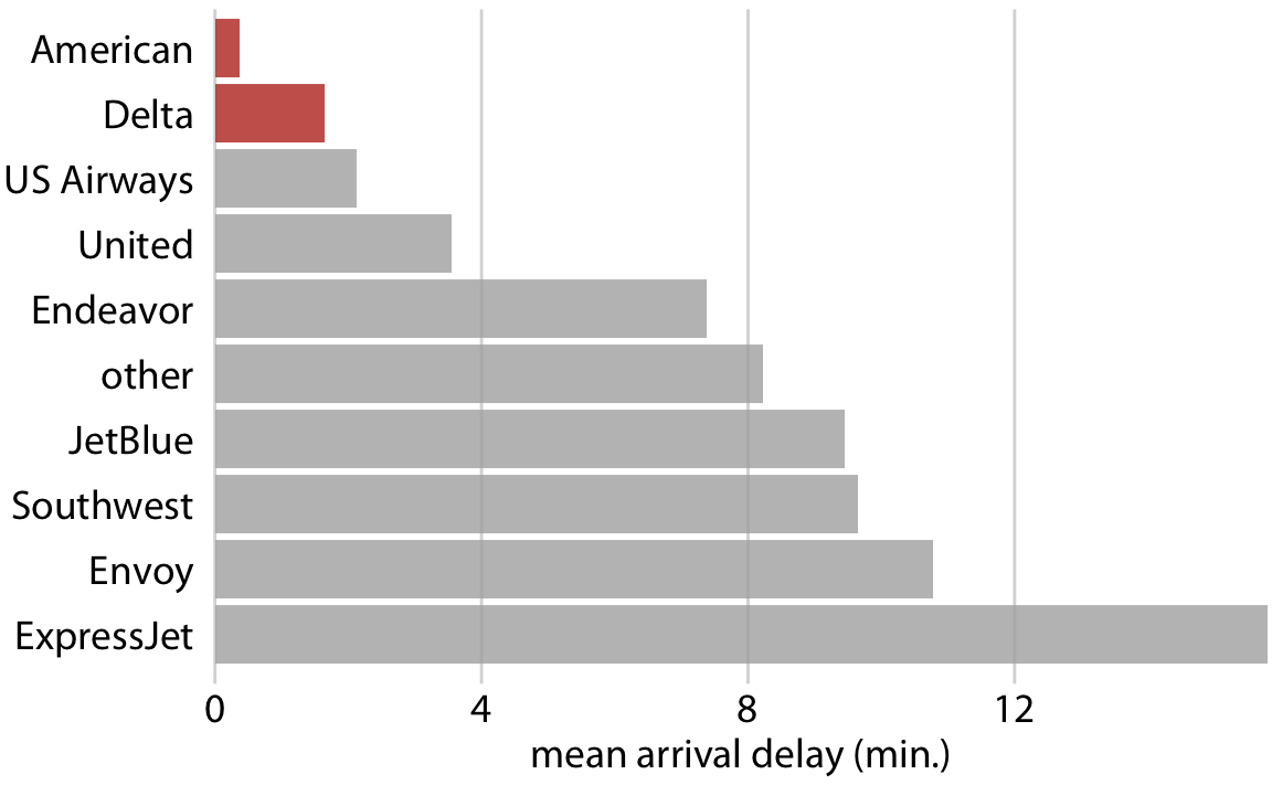
Figure 29.4: Mean arrival delay for flights out of the New York City area in 2013, by airline. American and Delta have the lowest mean arrival delays of all airlines flying out of the New York City area. Data source: U.S. Dept. of Transportation, Bureau of Transportation Statistics.
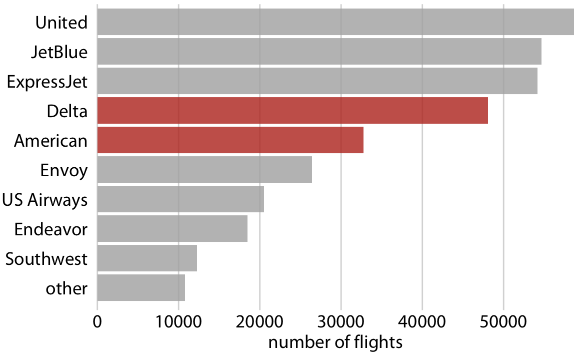
Figure 29.5: Number of flights out of the New York City area in 2013, by airline. Delta and American are fourth and fifths largest carrier by flights out of the New York City area. Data source: U.S. Dept. of Transportation, Bureau of Transportation Statistics.
When you’re trying to show too much data at once you may end up not showing anything.
29.3 Build up towards complex figures
Sometimes, however, we do want to show more complex figures that contain a large amount of information at once. In those cases, we can make things easier for our readers if we first show them a simplified version of the figure before we show the final one in its full complexity. The same approach is also highly recommended for presentations. Never jump straight to a highly complex figure; first show an easily digestible subset.
This recommendation is particularly relevant if the final figure is a small multiples plot (Chapter 21) showing a grid of subplots with similar structure. The full grid is much easier to digest if the audience has first seen a single subplot by itself. For example, Figure 29.6 shows the aggregate numbers of United Airlines departures out of Newark Airport (EWR) in 2013, broken down by weekday. Once we have seen and digested this figure, seeing the same information for ten airlines and three airports at once is much easier to process (Figure 29.7).
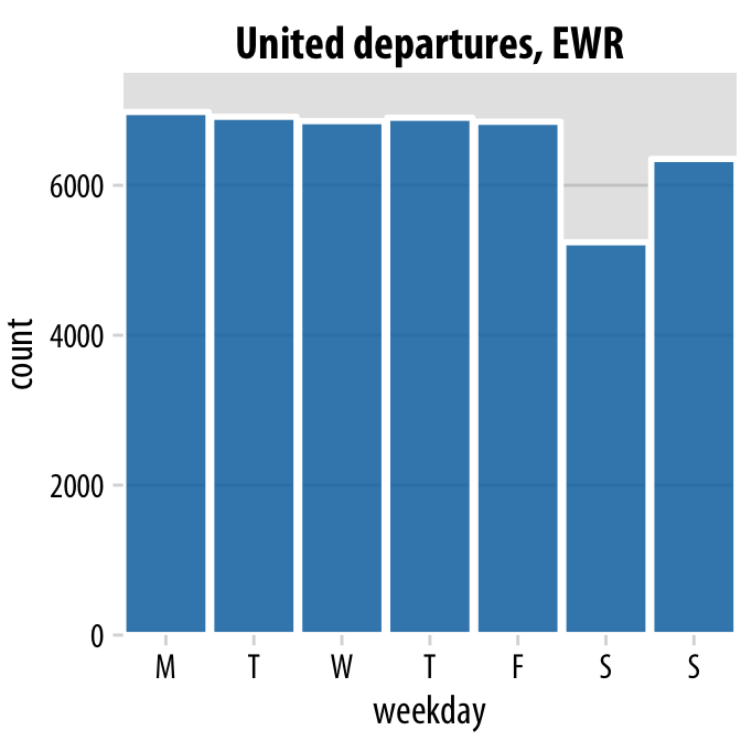
Figure 29.6: United Airlines departures out of Newark Airport (EWR) in 2013, by weekday. Most weekdays show approximately the same number of departures, but there are fewer departures on weekends. Data source: U.S. Dept. of Transportation, Bureau of Transportation Statistics.
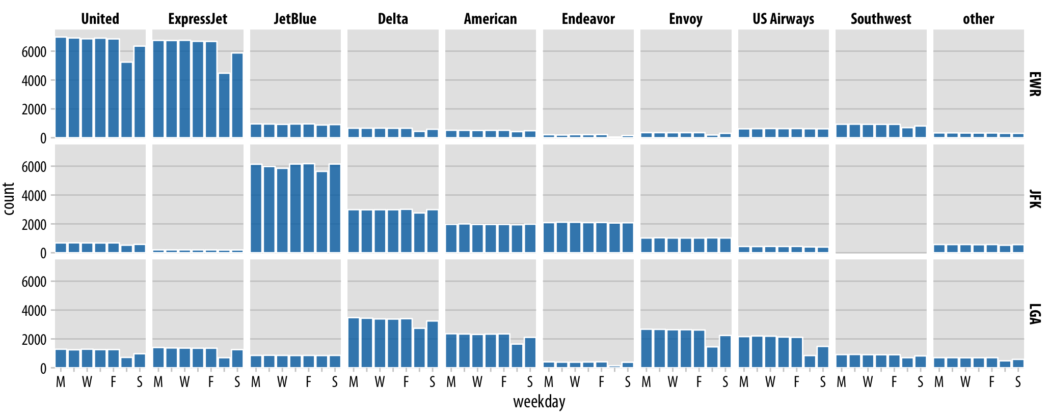
Figure 29.7: Departures out of airports in the New York city area in 2013, broken down by airline, airport, and weekday. United Airlines and ExpressJet make up most of the departures out of Newark Airport (EWR), JetBlue, Delta, American, and Endeavor make up most of the departures out of JFK, and Delta, American, Envoy, and US Airways make up most of the departures out of LaGuardia (LGA). Most but not all airlines have fewer departures on weekends than during the work week. Data source: U.S. Dept. of Transportation, Bureau of Transportation Statistics.
29.4 Make your figures memorable
Simple and clean figures such as simple bar plots have the advantage that they avoid distractions, are easy to read, and let your audience focus on the most important points you want to bring across. However, the simplicity can come with a disadvantage: Figures can end up looking generic. They don’t have any features that stand out and make them memorable. If I showed you ten bargraphs in quick succession you’d have a hard time keeping them apart and afterwards remembering what they showed. For example, if you take a quick look at Figure 29.8, you will notice the visual similarity to Figure 29.5, which I discussed earlier in this chapter. However, the two figures have nothing in common other than they are bar charts. Figure 29.5 showed the number of flights out of the New York City area by airline, whereas Figure 29.8 shows the most popular pets in U.S. households. Neither figure has any element that helps you intuitively perceive what topic the figure covers, and therefore neither figure is particularly memorable.
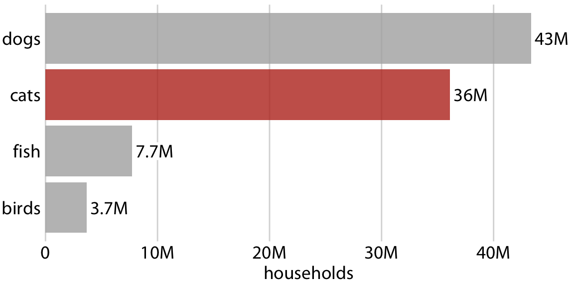
Figure 29.8: Number of households having one or more of the most popular pets: dogs, cats, fish, or birds. This bar graph is perfectly clear but not necessarily particularly memorable. The “cats” column has been highlighted solely to create visual similarity with Figure 29.5. Data source: 2012 U.S. Pet Ownership & Demographics Sourcebook, American Veterinary Medical Association
Research on human perception shows that more visually complex and unique figures are more memorable (Bateman et al. 2010; Borgo et al. 2012). However, visual uniqueness and complexity do not just affect memorability, as they may hinder a person’s ability to get a quick overview of the information or make it difficult to distinguish small differences in values. At the extreme, a figure could be highly memorable but utterly confusing. Such a figure would not be a good data visualization, even if it works well as a stunning piece of art. At the other extreme, figures may be very clear but forgettable and boring, and those figures may not have the impact we might hope for either. In general, we want to strike a balance between the two extremes and make our figures both memorable and clear. (The intended audience matters as well, however. If a figure is intended for a technical scientific publication, we will generally worry less about memorability than if the figure is intended for a broadly read newspaper or blog.)
We can make a figure more memorable by adding visual elements that reflect features of the data, for example drawings or pictograms of the things or objects that the dataset is about. One approach that is commonly taken is to show the data values itself in the form of repeated images, such that each copy of an image corresponds to a defined amount of the represented variable. For example, we can replace the bars in Figure 29.8 with repeated images of a dog, a cat, a fish, and a bird, drawn to a scale such that each complete animal corresponds to five million housholds (Figure 29.9). Thus, visually, Figure 29.9 still functions as a bar plot, but we now have added some visual complexity that makes the figure more memorable, and we have also shown the data using images that directly reflect what the data mean. After only a quick glance at the figure, you may be able to remember that there were many more dogs and cats than fish or birds. Importantly, in such visualizations, we want to use the images to represent the data, rather than using images simply to adorn the visualization or to annotate the axes. In psychological experiments, the latter choices tend to be distracting rather than helpful (Haroz, Kosara, and Franconeri 2015).
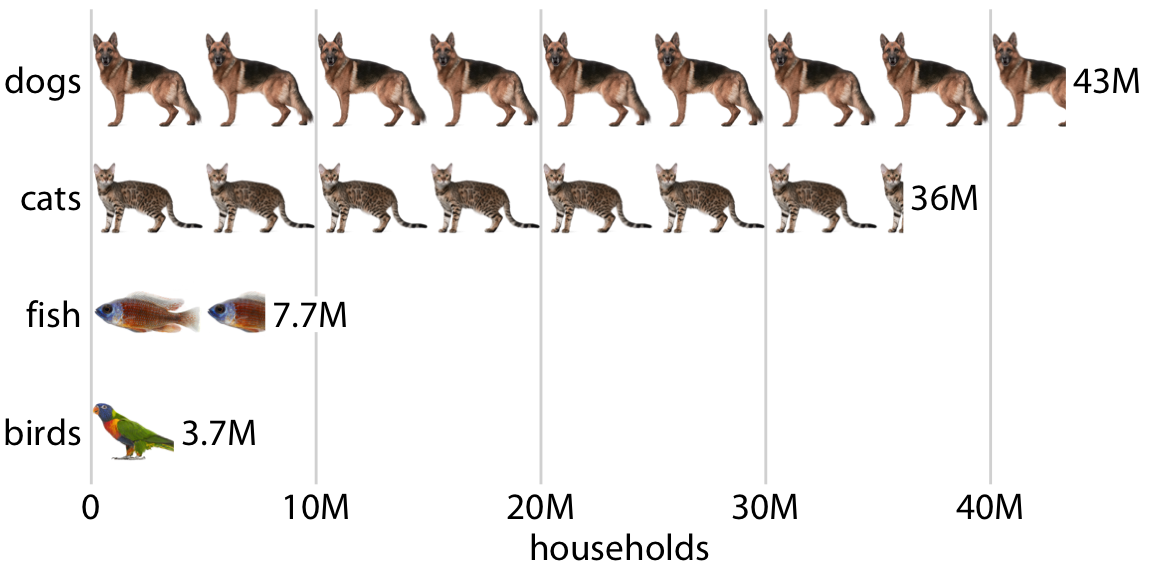
Figure 29.9: Number of households having one or more of the most popular pets, shown as an isotype graph. Each complete animal represents 5 million households who have that kind of pet. Data source: 2012 U.S. Pet Ownership & Demographics Sourcebook, American Veterinary Medical Association
Visualizations such as Figure 29.9 are often called isotype plots. The word isotype was introduced as an acronym of International System Of TYpographic Picture Education, and strictly speaking it refers to logo-like simplified pictograms that represent objects, animals, plants, or people (Haroz, Kosara, and Franconeri 2015). However, I think it makes sense to use the term isotype plot more broadly to apply to any type of visualization where repeated copies of the same image are used to indicate the magnitude of a value. After all, the prefix “iso” means “the same” and “type” can mean a particular kind, class, or group.
29.5 Be consistent but don’t be repetitive
When discussing compound figures in Chapter 21.2, I mentioned that it is important to use a consistent visual language for the different parts of a larger figure. The same is true across figures. If we make three figures that are all part of one larger story, then we need to design those figures so they look like they belong together. Using a consistent visual language does not mean, however, that everything should look exactly the same. On the contrary. It is important that figures describing different analyses look visually distinct, so that your audience can easily recognize where one analysis ends and another one starts. This is best achieved by using different visualization approaches for different parts of the overarching story. If you have used a bar plot already, next use a scatterplot, or a boxplot, or a line plot. Otherwise, the different analyses will blur together in your audience’s mind, and they will have a hard time distinguishing one part of the story from another. For example, if we re-design Figure 21.8 from Chapter 21.2 so it uses only bar plots, the result is noticeable less distinct and more confusing (Figure 29.10).
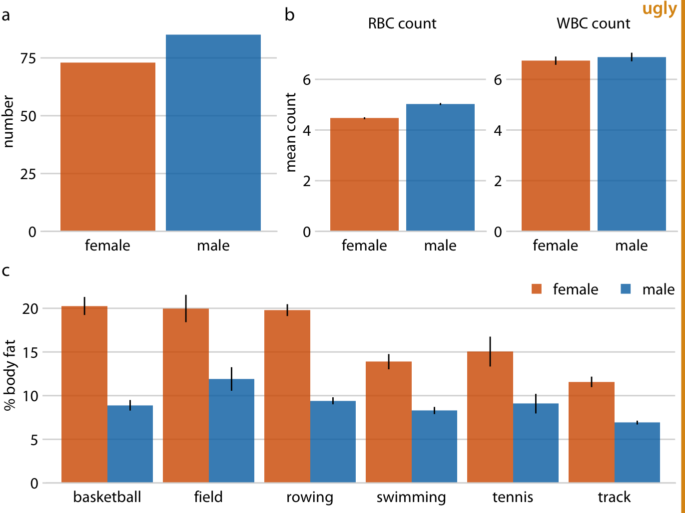
Figure 29.10: Physiology and body-composition of male and female athletes. Error bars indicate the standard error of the mean. This figure is overly repetitive. It shows the same data as Figure 21.8 and it uses a consistent visual language, but all sub-figures use the same type of visualization (bar plot). This makes it difficult for the reader to process that parts (a), (b), and (c) show entirely different results. Data source: Telford and Cunningham (1991)
When preparing a presentation or report, aim to use a different type of visualization for each distinct analysis.
Sets of repetitive figures are often a consequence of multi-part stories where each part is based on the same type of raw data. In those scenarios, it can be tempting to use the same type of visualization for each part. However, in aggregate, these figures will not hold the audience’s attention. As an example, let’s consider a story about the Facebook stock, in two parts: (i) the Facebook stock price has increased rapidly from 2012 to 2017; (ii) the price increase has outpaced that of other large tech companies. You might want to visualize these two statements with two figures showing stock price over time, as demonstrated in Figure 29.11. However, while Figure 29.11a serves a clear purpose and should remain as is, Figure 29.11b is at the same time repetitive and obscures the main point. We don’t particularly care about the exact temporal evolution of the stock price of Alphabet, Apple, and Microsoft, we just want to highlight that it grew less than the stock price of Facebook.
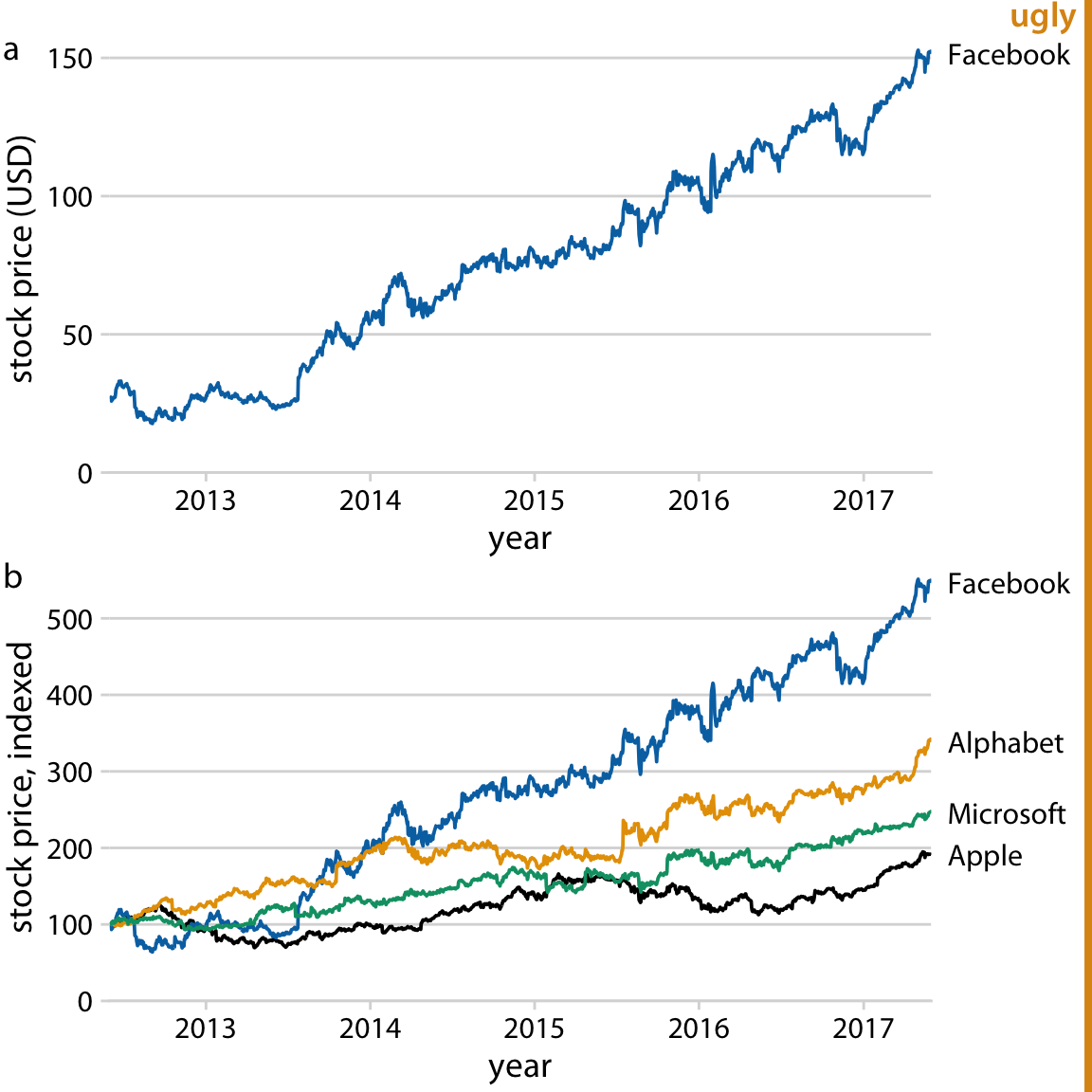
Figure 29.11: Growth of Facebook stock price over a five-year interval and comparison with other tech stocks. (a) The Facebook stock price rose from around $25/share in mid-2012 to $150/share in mid-2017. (b) The prices of other large tech companies did not rise comparably over the same time period. Prices have been indexed to 100 on June 1, 2012 to allow for easy comparison. This figure is labeled as “ugly” because parts (a) and (b) are repetitive. Data source: Yahoo Finance
I would recommend to leave part (a) as is but replace part (b) with a bar plot showing percent increase (Figure 29.12). Now we have two distinct figures that each make a unique, clear point and that work well in combination. Part (a) allows the reader to get familiar with the raw, underlying data and part (b) highlights the magnitude of the effect while removing any tangential information.
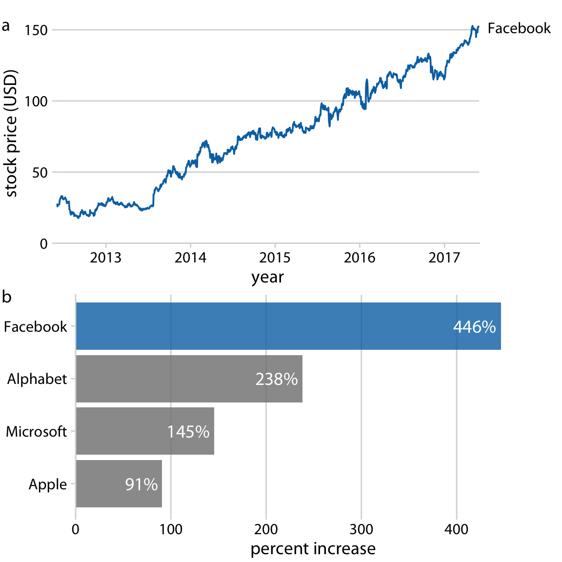
Figure 29.12: Growth of Facebook stock price over a five-year interval and comparison with other tech stocks. (a) The Facebook stock price rose from around $25/share in mid-2012 to $150/share in mid-2017, an increase of almost 450%. (b) The prices of other large tech companies did not rise comparably over the same time period. Price increases ranged from 90% to 240%. Data source: Yahoo Finance
Figure 29.12 highlights a general principle that I follow when preparing sets of figures to tell a story: I start with a figure that is as close as possible to showing the raw data, and in subsequent figures I show increasingly more derived quantities. Derived quantities (such as percent increases, averages, coefficients of fitted models, and so on) are useful to summarize key trends in large and complex datasets. However, because they are derived they are less intuitive, and if we show a derived quantity before we have shown the raw data our audience will find it difficult to follow. On the flip side, if we try to show all trends by showing raw data we will end up needing too many figures and/or being repetitive.
How many figures you should you use to tell your story? The answer depends on the publication venue. For a short blog post or tweet, make one figure. For scientific papers, I recommend between three and six figures. If I have many more than six figures for a scientific paper, then some of them need to be moved into an appendix or supplementary materials section. It is good to document all the evidence we have collected, but we must not wear out our audience by presenting excessive numbers of mostly similar-looking figures. In other contexts, a larger number of figures may be appropriate. However, in those contexts, we will usually be telling multiple stories, or an overarching story with subplots. For example, if I am asked to give an hour-long scientific presentation, I usually aim to tell three distinct stories. Similarly, a book or thesis will contain more than one story, and in fact may contain one story per chapter or section. In those scenarios, each distinct story-line or subplot should be presented with no more than three to six figures. In this book, you will find that I follow this principle at the level of sections within chapter. Each section is approximately self-contained and will typically show no more than six figures.
References
Schimel, J. 2011. Writing Science: How to Write Papers That Get Cited and Proposals That Get Funded. Oxford University Press.
Bateman, S., R. Mandryk, C. Gutwin, A. Genest, D. McDine, and C. Brooks. 2010. “Useful Junk? The Effects of Visual Embellishment on Comprehension and Memorability of Charts.” ACM Conference on Human Factors in Computing Systems, 2573–82. doi:10.1145/1753326.1753716.
Borgo, R., A. Abdul-Rahman, F. Mohamed, P. W. Grant, I. Reppa, and L. Floridi. 2012. “An Empirical Study on Using Visual Embellishments in Visualization.” IEEE Transactions on Visualization and Computer Graphics 18: 2759–68. doi:10.1109/TVCG.2012.197.
Haroz, S., R. Kosara, and S. L. Franconeri. 2015. “ISOTYPE Visualization: Working Memory, Performance, and Engagement with Pictographs.” ACM Conference on Human Factors in Computing Systems, 1191–1200. doi:10.1145/2702123.2702275.
Telford, R. D., and R. B. Cunningham. 1991. “Sex, Sport, and Body-Size Dependency of Hematology in Highly Trained Athletes.” Medicine and Science in Sports and Exercise 23: 788–94.