This is a post I originally wrote for my lab webpage. I’m reproducing it here (with minor edits) as an exercise in getting to know this blogging platform.
Confusing significance and effect size
Statistical significance (a low P value) measures how certain we are that a given effect exists.
Effect size measures the magnitude of an effect. What exactly effect size is depends on the analysis, examples are a correlation coefficient, the difference in means for a t test, or the odds ratio for a contingency-table analysis.
Many results we encounter in the real world are highly significant but of low magnitude. For example, if you knew with near certainty that a particular dietary supplement extended your life span, on average, by 2 weeks, would you care? Probably not. Even though the finding is highly significant (near certain), the magnitude of the effect is so low that it basically doesn’t matter. Yet it is common in scientific studies, and in press reports about them, to only emphasize the significance of a finding but not the magnitude. Sometimes authors don’t even bother to report effect sizes at all, they only report P values and point out how significant their results are. This is bad science. The P value is primarily a measure of the data set size. The larger the data set, the lower the P value, all else equal. To be important, an effect has to have a large magnitude; just being highly significant is not enough.
Correlation is not causation
This issue is pretty well known, yet people fall into this trap over and over again. Just because one quantity shows a statistical association (correlation) with another variable doesn’t mean that one of the two variables causes the other variable. This problem is more common in press reporting about scientific studies than in the studies themselves. For example, a study might report an association between cell-phone use and cancer. In the study, the authors might be careful to point out that they don’t know why increased cell-phone use correlates with cancer in their study population, and that the underlying cause might be unrelated to cell-phone use (e.g., for some reason exposure to a carcinogen correlates with cell-phone use in the study population). Yet, inevitably the press release about this study will read “cell-phone use causes cancer.”
In general, to reliably assign cause and effect, one needs to carry out an experimental study. In an experimental study, a population is randomly subdivided into treatment and control groups, and the treatment group is subjected to a well-defined experimental manipulation. For example, people are divided into two groups at random, one group is made to use a cell phone for 2 hours each day, the other group is forbidden from using a cell phone ever. After 5 years, count which group developed more cancer. By contrast, studies that only show association but not causation are usually observational studies. In such studies, we simply observe what variables are associated with each other in a sample.
Focusing on tenth-order effects and ignoring first-order effects
This issue is not so much an issue of poor statistics but rather of poor placement of emphasis. It is very well explained by Peter Attia here, so I’ll not elaborate on it any further here.
Aggregation by quantiles erroneously amplifies trend
In many situations, one would like to know how one quantitative variable relates to another. For example, we might be studying a certain bird species and ask whether the amount of a certain berry that males of that species eat has an effect on the mating success of those males. The canonical (and correct) way to study such questions is via correlation analyses.
However, it is surprisingly common to see analyses where instead one of the variables is aggregated into quantiles (groups of equal size) and the second variable is presented as an average of the quantiles of the first variable. In the above example, we might classify birds into four groups (quartiles) by their berry consumption (lowest 25%, second lowest 25%, and so on) and then plot the mean mating success within each group as a function of the quartile of berry consumption. Such an analysis is misleading, because it erroneously amplifies any relationship that may exist between the two variables.
Let’s illustrate this issue with some simulated data, using R. First we generate two variables x and y, weakly correlated:
n <- 10000 # sample size
x <- rnorm(n) # generate first set of normal variates
y <- 0.1*x + 0.9*rnorm(n) # generate second set, weakly correlated with first
cor.test( x, y )
This is the output from the cor.test() function:
#         Pearson's product-moment correlation
#
# data:  x and y
# t = 10.485, df = 9998, p-value < 2.2e-16
# alternative hypothesis: true correlation is not equal to 0
# 95 percent confidence interval:
#  0.084862 0.123636
# sample estimates:
#       cor
# 0.1042886
The correlation is highly significant (P < 2.2e-16) but weak (r = 0.10). The variable x explains only 1% (that is the square of the correlation coefficient, r^2) of the variation in y. In terms of the birds example, this could mean that while berry consumption is indeed related to mating success, the relationship is so weak as to be virtually meaningless. (Knowing how many berries a given male bird ate tells me pretty much nothing about his specific mating success.)
Figure 1 shows the relationship between x and y. As indicated by the correlation analysis, knowing x doesn’t really tell us anything about y.
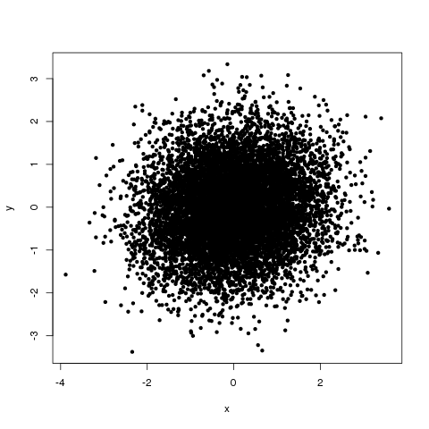
Figure 1: Relationship between x and y in our made-up example dataset.
Now let’s aggregate the data into quantiles of x and plot the mean +/- the standard error of y within each quantile of x:
# calculate to which quantile each x belongs
qn <- 10 # number of quantiles
q <- quantile(x, probs = seq(0, 1, 1/qn))
q[qn] <- q[qn] + 1 # make sure the last quantile is larger than max(x)
quant.x <- tapply(x, 1:n, (function(x) sum(x>=q)))

# calculate means and SEs of y per quantile
library( Hmisc ) # for errbar plot
mean.quant <- tapply(y, quant.x, mean)
SE.quant <- tapply(y, quant.x, (function(x) sd(x)/sqrt(length(x))))
errbar(1:qn, mean.quant, mean.quant+SE.quant, mean.quant-SE.quant, xlab='quantiles(x)', ylab='mean(y) for quantile')
In this example, we chose 10 quantiles. The resulting graph is shown in Figure 2.
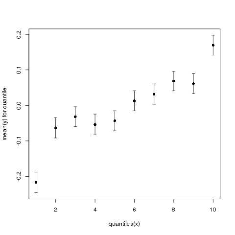
Figure 2: Mean y (+/- standard error) as a function of quantiles of x.
Suddenly, it looks like there is a very clear and quite strong relationship between x and y. If you were given only this graph, you might think that knowing how many berries a male eats would tell you a lot about that male’s mating success. Indeed, the top quantile, on average, has an approximately 200% higher y (200% higher mating success) than the bottom quantile.
Also note the apparent nonlinearity. The top and bottom quantiles seem to have very much increased/reduced y relative to the middle ones. Note that we see no such feature in the scatter plot of the original x and y values.
Finally, the exact same data look quite different depending on the exact number of quantiles. Figure 3 shows the same data presented with 6 quantiles.
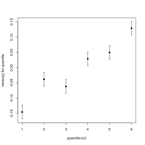
Figure 3: Mean y (+/- standard error) as a function of quantiles of x. Now using 6 instead of 10 quantiles.
And Figure 4 shows the same data presented with 20 quantiles.
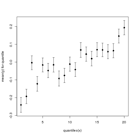
Figure 4: Mean y (+/- standard error) as a function of quantiles of x. Now using 20 instead of 10 quantiles.
As you can see, the same data look quite different depending on the exact number of quantiles we use.
So, whenever somebody shows you data aggregated into quantiles, ask for an x–y scatter plot and a correlation coefficient. And then square the correlation coefficient and evaluate the % variance explained. A squared correlation coefficient below 0.1 (r < 0.3) means the effect is pretty much non-existent, regardless of how low the P value is.