Doing a PCA in R is easy: Just run the function prcomp() on your matrix of scaled numeric predictor variables. There’s just one problem, however. The result is an object of class prcomp that doesn’t fit nicely into the tidyverse framework, e.g. for visualization. While it’s reasonably easy to extract the relevant info with some base-R manipulations, I’ve never been happy with this approach. But now, I’ve realized that all the necessary functions to do this tidyverse-style are available in the broom package.
For our PCA example, we’ll need the packages tidyverse and broom. Note that as of this writing, we need the current development version of broom because of a bug in tidy.prcomp(). We’ll also use the cowplot package for plot themes.
library(tidyverse)# ── Attaching packages ────────────────────────────────── tidyverse 1.3.0 ──# ✓ ggplot2 3.3.2 ✓ purrr 0.3.4
# ✓ tibble 3.0.3 ✓ dplyr 1.0.2
# ✓ tidyr 1.1.2 ✓ stringr 1.4.0
# ✓ readr 1.3.1 ✓ forcats 0.5.0# ── Conflicts ───────────────────────────────────── tidyverse_conflicts() ──
# x dplyr::filter() masks stats::filter()
# x dplyr::lag() masks stats::lag()library(broom) # devtools::install_github("tidymodels/broom")
library(cowplot)We’ll be analyzing the biopsy dataset, which comes originally from the MASS package. It is a breast cancer dataset from the University of Wisconsin Hospitals, Madison from Dr. William H. Wolberg. He assessed biopsies of breast tumors for 699 patients; each of nine attributes was scored on a scale of 1 to 10. The true outcome (benign/malignant) is also known.
biopsy <- read_csv("https://wilkelab.org/classes/SDS348/data_sets/biopsy.csv")# Parsed with column specification:
# cols(
# clump_thickness = col_double(),
# uniform_cell_size = col_double(),
# uniform_cell_shape = col_double(),
# marg_adhesion = col_double(),
# epithelial_cell_size = col_double(),
# bare_nuclei = col_double(),
# bland_chromatin = col_double(),
# normal_nucleoli = col_double(),
# mitoses = col_double(),
# outcome = col_character()
# )In general, when performing PCA, we’ll want to do (at least) three things:
- Look at the data in PC coordinates.
- Look at the rotation matrix.
- Look at the variance explained by each PC.
Let’s do these three things in turn.
Look at the data in PC coordinates
We start by running the PCA and storing the result in a variable pca_fit. There are two issues to consider here. First, the prcomp() function can only deal with numeric columns, so we need to remove all non-numeric columns from the data. This is straightforward using the where(is.numeric) tidyselect construct. Second, we normally want to scale the data values to unit variance before PCA. We do so by using the argument scale = TRUE in prcomp().
pca_fit <- biopsy %>%
  select(where(is.numeric)) %>% # retain only numeric columns
  prcomp(scale = TRUE) # do PCA on scaled data
As an alternative to scale = TRUE, we could also have scaled the data by explicitly invoking the scale() function.
pca_fit <- biopsy %>%
  select(where(is.numeric)) %>% # retain only numeric columns
  scale() %>% # scale data
  prcomp() # do PCA
Now, we want to plot the data in PC coordinates. In general, this means combining the PC coordinates with the original dataset, so we can color points by categorical variables present in the original data but removed for the PCA. We do this with the augment() function from broom, which takes as arguments the fitted model and the original data. The columns containing the fitted coordinates are called .fittedPC1, .fittedPC2, etc.
pca_fit %>%
  augment(biopsy) %>% # add original dataset back in
  ggplot(aes(.fittedPC1, .fittedPC2, color = outcome)) +
  geom_point(size = 1.5) +
  scale_color_manual(
    values = c(malignant = "#D55E00", benign = "#0072B2")
  ) +
  theme_half_open(12) + background_grid()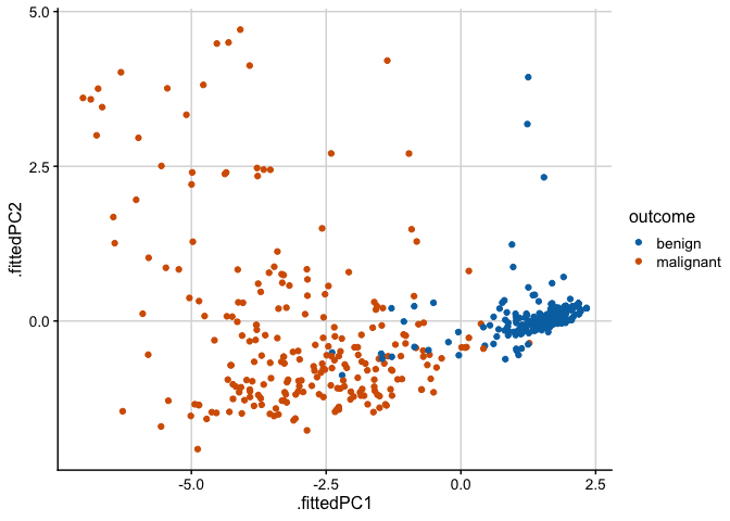
Look at the data in PC coordinates
Next, we plot the rotation matrix. The rotation matrix is stored as pca_fit$rotation, but here we’ll extract it using the tidy() function from broom. When applied to prcomp objects, the tidy() function takes an additional argument matrix, which we set to matrix = "rotation" to extract the rotation matrix.
# extract rotation matrix
pca_fit %>%
  tidy(matrix = "rotation")
# # A tibble: 81 x 3
# column PC value
# <chr> <dbl> <dbl>
# 1 clump_thickness 1 -0.302
# 2 clump_thickness 2 -0.141
# 3 clump_thickness 3 0.866
# 4 clump_thickness 4 -0.108
# 5 clump_thickness 5 0.0803
# 6 clump_thickness 6 -0.243
# 7 clump_thickness 7 -0.00852
# 8 clump_thickness 8 0.248
# 9 clump_thickness 9 -0.00275
# 10 uniform_cell_size 1 -0.381
# # … with 71 more rowsNow in the context of a plot:
# define arrow style for plotting
arrow_style <- arrow(
  angle = 20, ends = "first", type = "closed", length = grid::unit(8, "pt")
)

# plot rotation matrix
pca_fit %>%
  tidy(matrix = "rotation") %>%
  pivot_wider(names_from = "PC", names_prefix = "PC", values_from = "value") %>%
  ggplot(aes(PC1, PC2)) +
  geom_segment(xend = 0, yend = 0, arrow = arrow_style) +
  geom_text(
    aes(label = column),
    hjust = 1, nudge_x = -0.02,
    color = "#904C2F"
  ) +
  xlim(-1.25, .5) + ylim(-.5, 1) +
  coord_fixed() + # fix aspect ratio to 1:1
  theme_minimal_grid(12)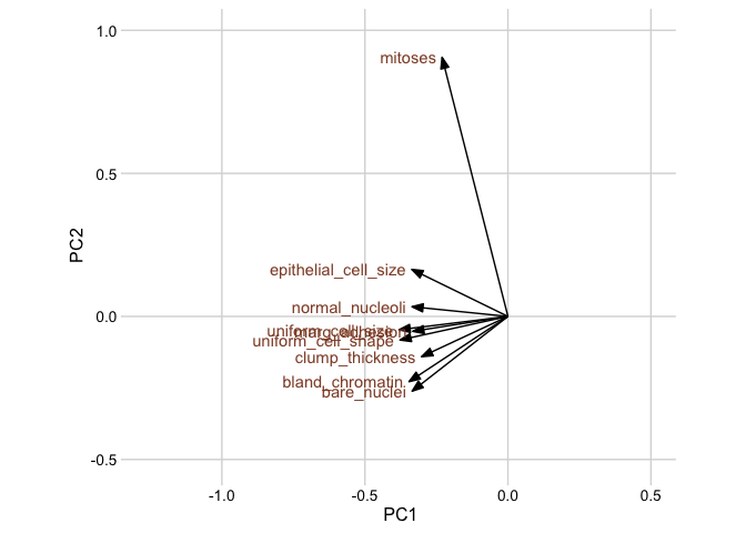
Look at the variance explained by each PC
Finally, we’ll plot the variance explained by each PC. We can again extract this information using the tidy() function from broom, now by setting the matrix argument to matrix = "eigenvalues".
pca_fit %>%
  tidy(matrix = "eigenvalues")
# # A tibble: 9 x 4
# PC std.dev percent cumulative
# <dbl> <dbl> <dbl> <dbl>
# 1 1 2.43 0.656 0.656
# 2 2 0.881 0.0862 0.742
# 3 3 0.734 0.0599 0.802
# 4 4 0.678 0.0511 0.853
# 5 5 0.617 0.0422 0.895
# 6 6 0.549 0.0335 0.928
# 7 7 0.543 0.0327 0.961
# 8 8 0.511 0.0290 0.990
# 9 9 0.297 0.00982 1Now in the context of a plot.
pca_fit %>%
  tidy(matrix = "eigenvalues") %>%
  ggplot(aes(PC, percent)) +
  geom_col(fill = "#56B4E9", alpha = 0.8) +
  scale_x_continuous(breaks = 1:9) +
  scale_y_continuous(
    labels = scales::percent_format(),
    expand = expansion(mult = c(0, 0.01))
  ) +
  theme_minimal_hgrid(12)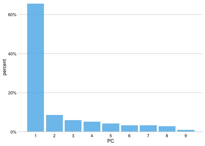
The first component captures 65% of the variation in the data and, as we can see from the first plot in this post, nicely separates the benign samples from the malignant samples.