The making of Sneronoi
30 December 2021
I recently released my generative art series Sneronoi on fx(hash). The series has been well received, it sold out quickly, and I’m quite happy with the final set of mints that has been revealed. And now that the release is over, let’s talk about how the series came to be and how it works under the hood.
First, some backstory. For much of the second half of 2021, I have been exploring t-distributed stochastic neighbor embedding (t-SNE) as a generative process for digital art. I started with simple point arrangements, as you can see here (my very first t-SNE based generative art project) or here. Next, I started using polygons to draw the point arrangements, which led me to the Foglie series and subsequently to Shards of Blue. I also tried raytraced 3D t-SNE sculptures. The t-SNE algorithm is quite versatile, and I’m confident there are many more ways to use it that remain still to be discovered.
Now, when I recently wrote a blog post about making generative art with R using code snippets brief enough to fit into a tweet, an example by 1Abstract caught my eye: It arranged points along a spiral and then displayed them with Voronoi tessellation. The output from about five lines of code was quite beautiful. This made me realize how powerful Voronoi tessellation is, and also that I had never combined it with t-SNE. So I went ahead and tried this, first in R. I’ll show you the complete code here so you can follow along. If you’ve read my post about using t-SNE for generative art, you’ll find quite a few similarities, as much of the basic logic is the same.
First we load the required packages and define a function that performs t-SNE on a given set of input coordinates and returns the resulting output coordinates.
library(tidyverse)
library(colorspace)
library(ggvoronoi)
library(Rtsne)

do_tsne <- function(coords, perplexity = 5) {
  tsne_fit <- coords %>%
    select(x, y) %>%
    scale() %>%
    Rtsne(perplexity = perplexity, max_iter = 500, check_duplicates = FALSE)

  tsne_fit$Y %>%
    scale() %>%
    as.data.frame() %>%
    cbind(select(coords, -x, -y)) %>%
    rename(x = V1, y = V2)
}
Next we need some input data. In all my experiments with t-SNE, I’ve
always used either spirals or stripes as input data, and so I did the
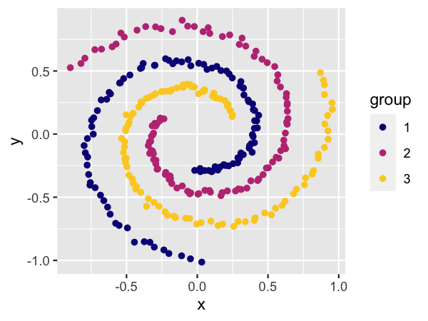
same here. Let’s first look at spirals. The function
setup_coords_spirals() arranges points along several intertwined spirals
and applies some noise to them.
setup_coords_spirals <- function(groups = 3, n = 100, sd = .015, from = 3, to = 5, alpha = 2.5) {
  t <- rep(seq(from = from * pi, to = to * pi, length.out = n), groups)
  angle <- 2*pi*rep((0:(groups - 1))/groups, each = n)
  C <- max(t^alpha)

  x = t^alpha*sin(-t + angle)/C + rnorm(groups * n, mean = 0, sd = sd)
  y = t^alpha*cos(-t + angle)/C + rnorm(groups * n, mean = 0, sd = sd)
  group <- factor(rep(1:groups, each = n))

  tibble(
    x, y, group,
    id = factor(rep((1:groups)*n, each = n) + rep(1:n, groups) - 1)
  )
}

ggplot(setup_coords_spirals(), aes(x, y, color = group)) +
  geom_point() +
  scale_color_viridis_d(option = "C", end = 0.9)
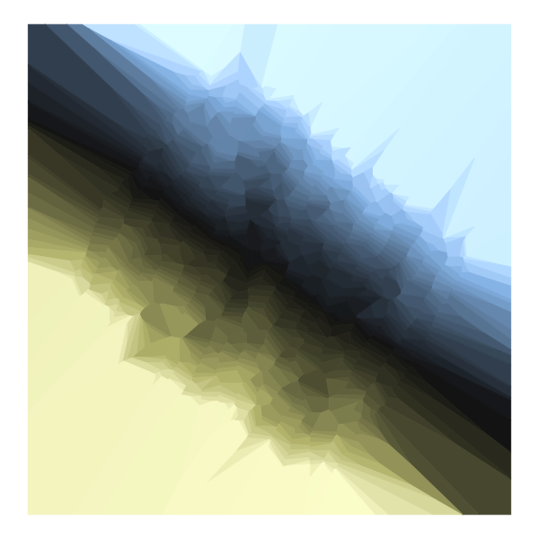
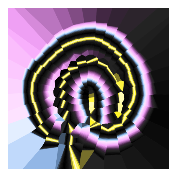
This leads us to our Sneronoi Concept #1. We generate fifty (!) intertwined spirals, run t-SNE over the data points, and visualize the result with Voronoi tessellation.
set.seed(3522)

setup_coords_spirals(groups = 50, n = 50, sd = 0.) %>%
  do_tsne(perplexity = 10) %>%
  mutate(
   color = colorspace::sequential_hcl(n(), palette = "Lajolla")
  ) %>%
  ggplot(aes(x, y, color = color, fill = color)) +
  geom_voronoi(size = 0.2) +
  scale_color_identity(aesthetics = c("color", "fill")) +
  coord_fixed() +
  theme_void()
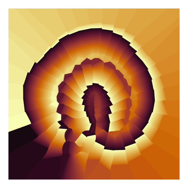
The trick to generating the unique coloring effect that displays both smooth color gradients and harsh breaks in color is that we’re coloring all points sequentially, regardless of group identity. Then, within groups the points that are spatially close in the input data will typically also have similar colors, but at group boundaries colors are similar but points are spatially separated.
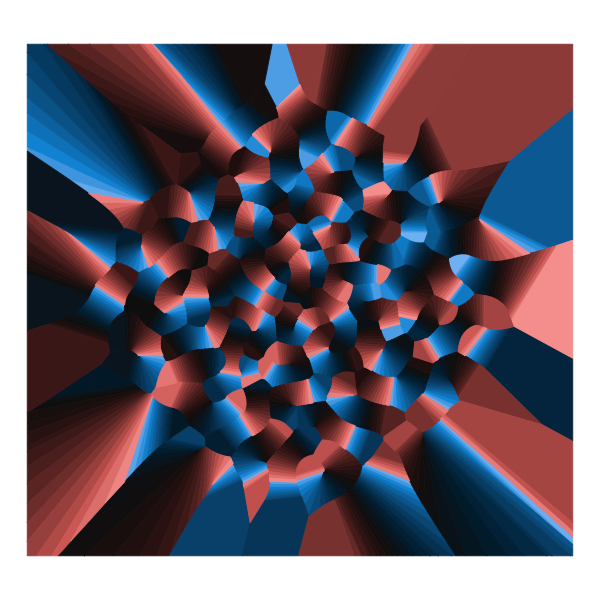
As always with t-SNE, the exact arrangement of input data, the perplexity parameter, and the random number seed all affect the output. Here is Concept #2, which looks entirely different despite only minor changes in the code.
set.seed(12356)

setup_coords_spirals(groups = 30, n = 60, sd = 0.) %>%
  do_tsne(perplexity = 2) %>%
  mutate(
    color = colorspace::diverging_hcl(n(), palette = "Berlin")
  ) %>%
  ggplot(aes(x, y, color = color, fill = color)) +
  geom_voronoi(size = 0.2) +
  scale_color_identity(aesthetics = c("color", "fill")) +
  coord_fixed() +
  theme_void()
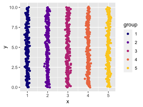
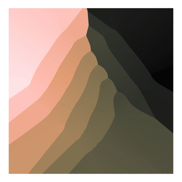
For Concepts #3 and #4 I used input data in stripe form.
setup_coords_stripes <- function(groups = 5, n = 200, sd = .05) {
  tibble(
    x = rep(1:groups, each = n) + rnorm(groups*n, sd = sd),
    y = rep(seq(from = 0, to = 10, length.out = n), groups) +
      rnorm(groups*n, sd = sd),
    group = factor(rep(1:groups, each = n))
  )
}

ggplot(setup_coords_stripes(), aes(x, y, color = group)) +
  geom_point() +
  scale_color_viridis_d(option = "C", end = 0.9)
The code for Concept #3 is again mostly identical to the prior code examples, except for the change in input data. The output has an entirely different character, though.
set.seed(13235)

setup_coords_stripes(groups = 50, n = 20, sd = 0.1) %>%
  do_tsne(perplexity = 6) %>%
  mutate(
    color = colorspace::diverging_hcl(n(), palette = "Lisbon")
  ) %>%
  ggplot(aes(x, y, color = color, fill = color)) +
  geom_voronoi(size = 0.2) +
  scale_color_identity(aesthetics = c("color", "fill")) +
  coord_fixed() +
  theme_void()
Concept #4 has a smaller number of groups and a larger number of points per group.
set.seed(6532)

setup_coords_stripes(groups = 10, n = 100, sd = 0.1) %>%
  do_tsne(perplexity = 15) %>%
  mutate(
    color = colorspace::sequential_hcl(n(), palette = "Turku")
  ) %>%
  ggplot(aes(x, y, color = color, fill = color)) +
  geom_voronoi(size = 0.2) +
  scale_color_identity(aesthetics = c("color", "fill")) +
  coord_fixed() +
  theme_void()
As you can see, it isn’t very difficult to make these in R. I had the first drafts ready in a few minutes, and it took me maybe an hour or two to find interesting parameter settings, such as the ones shown here. To turn this into an fx(hash) project though required much more work. I needed to recode everything in JavaScript so images could be rendered in a browser window. I also needed my own color palettes, as I didn’t think preexisting palettes were appropriate. The palettes used in the concepts (Lajolla, Berlin, Lisbon, Turku) were created by Fabio Crameri, and while I like them a lot I felt that a major art project deserved its own special color palettes. There’s also no reason in an art project to stick to the strict design criteria Fabio Crameri applied to his palettes, which are meant for data visualization. So I could be a bit more adventurous.
To make my own palettes, I searched for photos I found inspiring and picked colors from them. For example, Slot Canyon and Slot Canyon 2 are both from photos of slot canyons, Beach is from a photo of a beach, City is from a photo of New York City, and so on. And two of the color palettes are completely made up, Monochrome (which simply runs from white to black) and Dark Nebula, where I wanted to create a palette with deep black interspersed with lights of different colors.
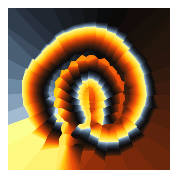
As an example, let’s look at Slot Canyon 2.
slot_canyon2 <- function(n, b = 1) {
  x <- ((0:(n-1))/(n-1))^b
  scales::colour_ramp(
    c("#D9E9F6", "#7B99B1", "#34404F", "#050507", "#3D200E",
      "#943A07", "#F76504", "#FFD207", "#FBFDA1"))(x)
}

plot_palette <- function(colors) {
  ggplot(tibble(color = colors, x = 1:length(colors), y = 1)) +
    aes(x, y, color = color, fill = color) +
    geom_tile(size = 0.2) + scale_color_identity(aesthetics = c("color", "fill")) +
    theme_void()
}

plot_palette(slot_canyon2(200))

The parameter b adds additional variation to the color palettes by
emphasizing either one or the other end of the palette. It is reported
as “palette distortion” to the JavaScript console when you run the
Sneronoi JavaScript code in your browser.
I use numbers between 0.5 and 2, uniformly distributed on a log scale. A palette distortion of 0.5 compresses much of the left side of the palette.
plot_palette(slot_canyon2(200, .5))

And similarly, a palette distortion of 2 compresses much of the right side.
plot_palette(slot_canyon2(200, 2))

Let’s re-render the first Sneronoi concept with the Slot Canyon palette.
set.seed(3522)

setup_coords_spirals(groups = 50, n = 50, sd = 0.) %>%
  do_tsne(perplexity = 10) %>%
  mutate(
   color = slot_canyon2(n(), 0.75)
  ) %>%
  ggplot(aes(x, y, color = color, fill = color)) +
  geom_voronoi(size = 0.2) +
  scale_color_identity(aesthetics = c("color", "fill")) +
  coord_fixed() +
  theme_void()
Let’s try a different palette, Glacier.
glacier <- function(n, b = 1) {
  x <- ((0:(n-1))/(n-1))^b
  scales::colour_ramp(
    c("#424947", "#9EB2C1", "#C4D2E0", "#E2F2FD",
      "#9DD0EA", "#4E9BC8", "#025B95"))(x)
}

set.seed(3522)

setup_coords_spirals(groups = 50, n = 50, sd = 0.) %>%
  do_tsne(perplexity = 10) %>%
  mutate(
   color = glacier(n(), 1.4)
  ) %>%
  ggplot(aes(x, y, color = color, fill = color)) +
  geom_voronoi(size = 0.2) +
  scale_color_identity(aesthetics = c("color", "fill")) +
  coord_fixed() +
  theme_void()

And finally, Dark Nebula, with two different palette distortion values.
dark_nebula <- function(n, b = 1) {
  x <- ((0:(n-1))/(n-1))^b
  scales::colour_ramp(
    c('#FEEBFF', '#FAB9FC', '#A970AC', '#4A304B', "#303030",
      "#202020", "#101010", "#000000", "#101010", "#202020",
      "#303030", '#FFF324', '#FFFDE8', '#FFF324', "#303030",
      "#202020", "#101010", "#000000", "#000000", "#101010",
      "#202020", "#303030", '#556D86', '#8BB4E0', '#C3DDFB',
      '#E8F2FF'))(x)
}
set.seed(3522)

setup_coords_spirals(groups = 50, n = 50, sd = 0.) %>%
  do_tsne(perplexity = 10) %>%
  mutate(
   color = dark_nebula(n(), 0.7)
  ) %>%
  ggplot(aes(x, y, color = color, fill = color)) +
  geom_voronoi(size = 0.2) +
  scale_color_identity(aesthetics = c("color", "fill")) +
  coord_fixed() +
  theme_void()
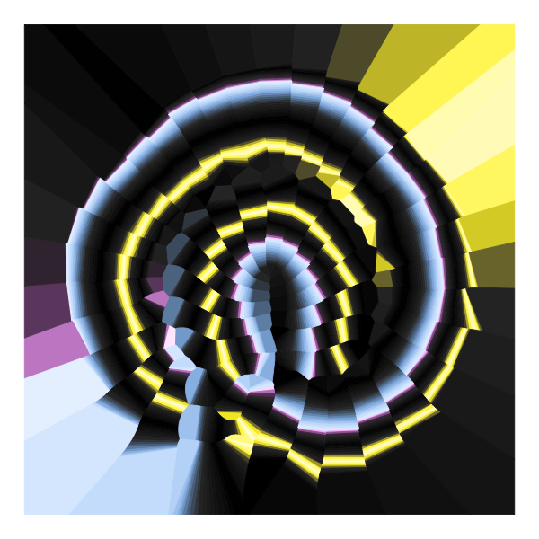
set.seed(3522)

setup_coords_spirals(groups = 50, n = 50, sd = 0.) %>%
  do_tsne(perplexity = 10) %>%
  mutate(
   color = dark_nebula(n(), 1.6)
  ) %>%
  ggplot(aes(x, y, color = color, fill = color)) +
  geom_voronoi(size = 0.2) +
  scale_color_identity(aesthetics = c("color", "fill")) +
  coord_fixed() +
  theme_void()
You can see how the same geometric arrangement of polygons can look quite different depending on the color palette used and the distortion factor applied.
Once I had my final color palettes, I needed to recode everything in JavaScript. This posed three technical problems: 1. How do I interpolate colors? 2. How do I generate a Voronoi tessellation? 3. How do I run t-SNE?
For color interpolation, I found
chroma.js by Gregor Aisch. It has a scale()
function that does exactly what I need. This one was easy. Next, for
Voronoi tessellation, I went with D3, which provides a very efficient
implementation based on Delaunay
triangulation. Finally, t-SNE. This one is a headache. There are several
t-SNE implementations, but most of them are quite old, not particularly
well maintained, and also slow. The simplest and easiest one to use is
tSNEJS by Andrej Karpathy. It is a
demo he wrote in 2014, and the entire repository has only 13 commits.
And still, it’s one of the best JavaScript t-SNE implementations out
there. But when I tried it on my input data I found it was too slow for
my purposes. People don’t like generative art to take twenty minutes to
render and/or turn their browser into an unresponsive mess.
The thing about t-SNE is that a naive implementation is quadratic in the number of input data points, and thus the algorithm slows down dramatically once the input data grows beyond a few hundred points. But there are ways to speed it up, using various tree-based algorithms (van der Maaten 2014). So I started writing my own t-SNE implementation from scratch, implementing as much of the ideas from the van der Maaten paper as seemed reasonable. Specifically, I implemented the Barnes-Hut algorithm that breaks down the solution space into a nested tree structure and replaces individual forces between points with aggregate forces when points are sufficiently far away. This was a great exercise and I learned a lot, but it turns out that once all was said and done the Barnes-Hut algorithm only started to show improvements beyond the naive quadratic implementation when I worked with more than about 2500 input data points, at which point the implementation was too slow to be used interactively anyways. (The final Sneronoi code limits the number of data points to 2200.) However, by rewriting the code from scratch, I had somehow made it sufficiently faster than Karpathy’s implementation that even the quadratic algorithm was usable. I’m not entirely sure why that is, but I believe the main reason is that I simply hardcoded two input and two output dimensions, which saved me a lot of inner loops over the number of dimensions of the data.
So with all three technical problems solved, I could go ahead and implement a Sneronoi version for fx(hash). Along the way, I also wrote my own pseudorandom number generator class, which you may find helpful if you’re developing generative art projects for fx(hash) or other JavaScript-based environments. The final step was choosing probability distributions for the random parameter settings that would create a wide range of interesting, different results while avoiding overly repetitive or boring outputs. There’s some secret sauce here that I’ll keep for myself. I released the series for public minting on December 27, 2021, as a series of 200 unique pieces, and you can see the entire collection here.
Update 03/28/2022: The entire Sneronoi code is now publicly available, licensed under CC-BY.