2 Visualizing data: Mapping data onto aesthetics
Whenever we visualize data, we take data values and convert them in a systematic and logical way into the visual elements that make up the final graphic. Even though there are many different types of data visualizations, and on first glance a scatter plot, a pie chart, and a heatmap don’t seem to have much in common, all these visualizations can be described with a common language that captures how data values are turned into blobs of ink on paper or colored pixels on screen. The key insight is the following: All data visualizations map data values into quantifiable features of the resulting graphic. We refer to these features as aesthetics.
2.1 Aesthetics and types of data
Aesthetics describe every aspect of a given graphical element. A few examples are provided in Figure 2.1. A critical component of every graphical element is of course its position, which describes where the element is located. In standard 2d graphics, we describe positions by an x and y value, but other coordinate systems and one- or three-dimensional visualizations are possible. Next, all graphical elements have a shape, a size, and a color. Even if we are preparing a black-and-white drawing, graphical elements need to have a color to be visible, for example black if the background is white or white if the background is black. Finally, to the extent we are using lines to visualize data, these lines may have different widths or dash–dot patterns. Beyond the examples shown in Figure 2.1, there are many other aesthetics we may encounter in a data visualization. For example, if we want to display text, we may have to specify font family, font face, and font size, and if graphical objects overlap, we may have to specify whether they are partially transparent.
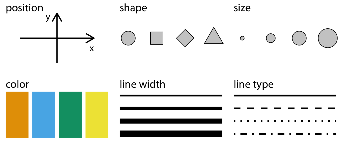
Figure 2.1: Commonly used aesthetics in data visualization: position, shape, size, color, line width, line type. Some of these aesthetics can represent both continuous and discrete data (position, size, line width, color) while others can usually only represent discrete data (shape, line type).
All aesthetics fall into one of two groups: Those that can represent continuous data and those that can not. Continuous data values are values for which arbitrarily fine intermediates exist. For example, time duration is a continuous value. Between any two durations, say 50 seconds and 51 seconds, there are arbitrarily many intermediates, such as 50.5 seconds, 50.51 seconds, 50.50001 seconds, and so on. By contrast, number of persons in a room is a discrete value. A room can hold 5 persons or 6, but not 5.5. For the examples in Figure 2.1, position, size, color, and line width can represent continuous data, but shape and line type can usually only represent discrete data.
Next we’ll consider the types of data we may want to represent in our visualization. You may think of data as numbers, but numerical values are only two out of several types of data we may encounter. In addition to continuous and discrete numerical values, data can come in the form of discrete categories, in the form of dates or times, and as text (Table 2.1). When data is numerical we also call it quantitative and when it is categorical we call it qualitative. Variables holding qualitative data are factors, and the different categories are called levels. The levels of a factor are most commonly without order (as in the example of “dog”, “cat”, “fish” in Table 2.1), but factors can also be ordered, when there is an intrinsic order among the levels of the factor (as in the example of “good”, “fair”, “poor” in Table 2.1).
| Type of variable | Examples | Appropriate scale | Description |
|---|---|---|---|
| quantitative/numerical continuous | 1.3, 5.7, 83, 1.5x10⁻² | continuous | Arbitrary numerical values. These can be integers, rational numbers, or real numbers. |
| quantitative/numerical discrete | 1, 2, 3, 4 | discrete | Numbers in discrete units. These are most commonly but not necessarily integers. For example, the numbers 0.5, 1.0, 1.5 could also be treated as discrete if intermediate values cannot exist in the given dataset. |
| qualitative/categorical unordered | dog, cat, fish | discrete | Categories without order. These are discrete and unique categories that have no inherent order. These variables are also called factors. |
| qualitative/categorical ordered | good, fair, poor | discrete | Categories with order. These are discrete and unique categories with an order. For example, “fair” always lies between “good” and “poor”. These variables are also called ordered factors. |
| date or time | Jan. 5 2018, 8:03am | continuous or discrete | Specific days and/or times. Also generic dates, such as July 4 or Dec. 25 (without year). |
| text | The quick brown fox jumps over the lazy dog. | none, or discrete | Free-form text. Can be treated as categorical if needed. |
To examine a concrete example of these various types of data, take a look at Table 2.2. It shows the first few rows of a dataset providing the daily temperature normals (average daily temperatures over a 30-year window) for four U.S. locations. This table contains five variables: month, day, location, station ID, and temperature (in degrees Fahrenheit). Month is an ordered factor, day is a discrete numerical value, location is an unordered factor, station ID is similarly an unordered factor, and temperature is a continuous numerical value.
| Month | Day | Location | Station ID | Temperature |
|---|---|---|---|---|
| Jan | 1 | Chicago | USW00014819 | 25.6 |
| Jan | 1 | San Diego | USW00093107 | 55.2 |
| Jan | 1 | Houston | USW00012918 | 53.9 |
| Jan | 1 | Death Valley | USC00042319 | 51.0 |
| Jan | 2 | Chicago | USW00014819 | 25.5 |
| Jan | 2 | San Diego | USW00093107 | 55.3 |
| Jan | 2 | Houston | USW00012918 | 53.8 |
| Jan | 2 | Death Valley | USC00042319 | 51.2 |
| Jan | 3 | Chicago | USW00014819 | 25.3 |
| Jan | 3 | San Diego | USW00093107 | 55.3 |
| Jan | 3 | Death Valley | USC00042319 | 51.3 |
| Jan | 3 | Houston | USW00012918 | 53.8 |
2.2 Scales map data values onto aesthetics
To map data values onto aesthetics, we need to specify which data values correspond to which specific aesthetics values. For example, if our graphic has an x axis, then we need to specify which data values fall onto particular positions along this axis. Similarly, we may need to specify which data values are represented by particular shapes or colors. This mapping between data values and aesthetics values is created via scales. A scale defines a unique mapping between data and aesthetics (Figure 2.2). Importantly, a scale must be one-to-one, such that for each specific data value there is exactly one aesthetics value and vice versa. If a scale isn’t one-to-one, then the data visualization becomes ambiguous.
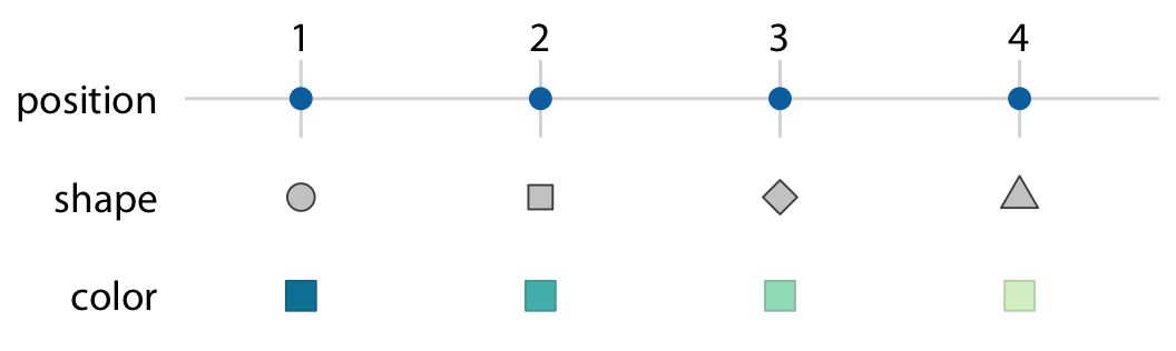
Figure 2.2: Scales link data values to aesthetics. Here, the numbers 1 through 4 have been mapped onto a position scale, a shape scale, and a color scale. For each scale, each number corresponds to a unique position, shape, or color and vice versa.
Let’s put things into practice. We can take the dataset shown in Table 2.2, map temperature onto the y axis, day of the year onto the x axis, location onto color, and visualize these aesthetics with solid lines. The result is a standard line plot showing the temperature normals at the four locations as they change during the year (Figure 2.3).
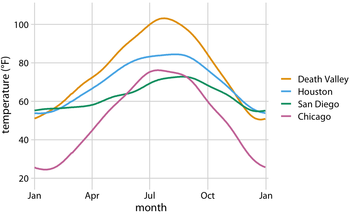
Figure 2.3: Daily temperature normals for four selected locations in the U.S. Temperature is mapped to the y axis, day of the year to the x axis, and location to line color. Data source: NOAA.
Figure 2.3 is a fairly standard visualization for a temperature curve and likely the visualization most data scientists would intuitively choose first. However, it is up to us which variables we map onto which scales. For example, instead of mapping temperature onto the y axis and location onto color, we can do the opposite. Because now the key variable of interest (temperature) is shown as color, we need to show sufficiently large colored areas for the color to convey useful information (Stone, Albers Szafir, and Setlur 2014). Therefore, for this visualization I have chosen squares instead of lines, one for each month and location, and I have colored them by the average temperature normal for each month (Figure 2.4).
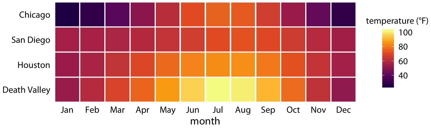
Figure 2.4: Monthly normal mean temperatures for four locations in the U.S. Data source: NOAA
I would like to emphasize that Figure 2.4 uses two position scales (month along the x axis and location along the y axis) but neither is a continuous scale. Month is an ordered factor with 12 levels and location is an unordered factor with four levels. Therefore, the two position scales are both discrete. For discrete position scales, we generally place the different levels of the factor at an equal spacing along the axis. If the factor is ordered (as is here the case for month), then the levels need to placed in the appropriate order. If the factor is unordered (as is here the case for location), then the order is arbitrary, and we can choose any order we want. I have ordered the locations from overall coldest (Chicago) to overall hottest (Death Valley) to generate a pleasant staggering of colors. However, I could have chosen any other order and the figure would have been equally valid.
Both Figures 2.3 and 2.4 used three scales in total, two position scales and one color scale. This is a typical number of scales for a basic visualization, but we can use more than three scales at once. Figure 2.5 uses five scales, two position scales, one color scale, one size scale, and one shape scale, and all scales represent a different variable from the dataset.
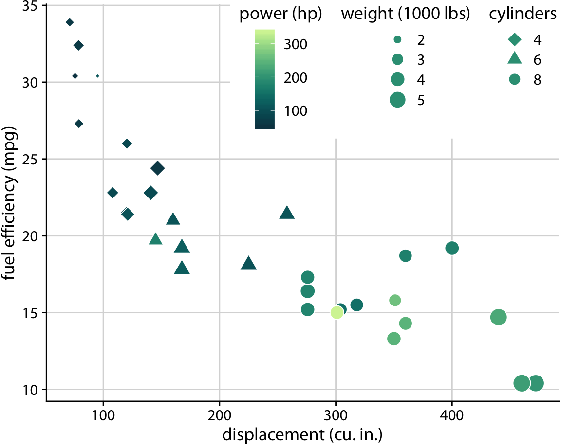
Figure 2.5: Fuel efficiency versus displacement, for 32 cars (1973–74 models). This figure uses five separate scales to represent data: (i) the x axis (displacement); (ii) the y axis (fuel efficiency); (iii) the color of the data points (power); (iv) the size of the data points (weight); and (v) the shape of the data points (number of cylinders). Four of the five variables displayed (displacement, fuel efficiency, power, and weight) are numerical continuous. The remaining one (number of cylinders) can be considered to be either numerical discrete or qualitative ordered. Data source: Motor Trend, 1974.
References
Stone, M., D. Albers Szafir, and V. Setlur. 2014. “An Engineering Model for Color Difference as a Function of Size.” In 22nd Color and Imaging Conference. Society for Imaging Science and Technology.