23 Balance the data and the context
We can broadly subdivide the graphical elements in any visualization into elements that represent data and elements that do not. The former are elements such as the points in a scatter plot, the bars in a histogram or barplot, or the shaded areas in a heatmap. The latter are elements such as plot axes, axis ticks and labels, axis titles, legends, and plot annotations. These elements generally provide context for the data and/or visual structure to the plot. When designing a plot, it can be helpful to think about the amount of ink (Chapter 17) used to represent data and context. A common recommendation is to reduce the amount of non-data ink, and following this advice can often yield less cluttered and more elegant visualizations. At the same time, context and visual structure are important, and overly minimizing the plot elements that provide them can result in figures that are difficult to read, confusing, or simply not that compelling.
23.1 Providing the appropriate amount of context
The idea that distinguishing between data and non-data ink may be useful was popularized by Edward Tufte in his book “The Visual Display of Quantitative Information” (Tufte 2001). Tufte introduces the concept of the “data–ink ratio”, which he defines as the “proportion of a graphic’s ink devoted to the non-redundant display of data-information.” He then writes (emphasis mine):
Maximize the data–ink ratio, within reason.
I have emphasized the phrase “within reason” because it is critical and frequently forgotten. In fact, I think that Tufte himself forgets it in the remainder of his book, where he advocates overly minimalistic designs that, in my opinion, are neither elegant nor easy to decipher. If we interpret the phrase “maximize the data–ink ratio” to mean “remove clutter and strive for clean and elegant designs,” then I think it is reasonable advice. But if we interpret it as “do everything you can to remove non-data ink” then it will result in poor design choices. If we go too far in either direction we will end up with ugly figures. However, away from the extremes there is wide range of designs that are all acceptable and may be appropriate in different settings.
To explore the extremes, let’s consider a figure that clearly has too much non-data ink (Figure 23.1). The colored points in the plot panel (the framed center area containing data points) are data ink. Everything else is non-data ink. The non-data ink includes a frame around the entire figure, a frame around the plot panel, and a frame around the legend. None of these frames are needed. We also see a prominent and dense background grid that draws attention away from the actual data points. By removing the frames and minor grid lines and by drawing the major grid lines in a light gray, we arrive at Figure 23.2. In this version of the figure, the actual data points stand out much more clearly, and they are perceived as the most important component of the figure.
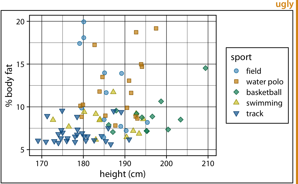
Figure 23.1: Percent body fat versus height in professional male Australian athletes. Each point represents one athlete. This figure devotes way too much ink to non-data. There are unnecessary frames around the entire figure, around the plot panel, and around the legend. The coordinate grid is very prominent, and its presence draws attention away from the data points. Data source: Telford and Cunningham (1991)
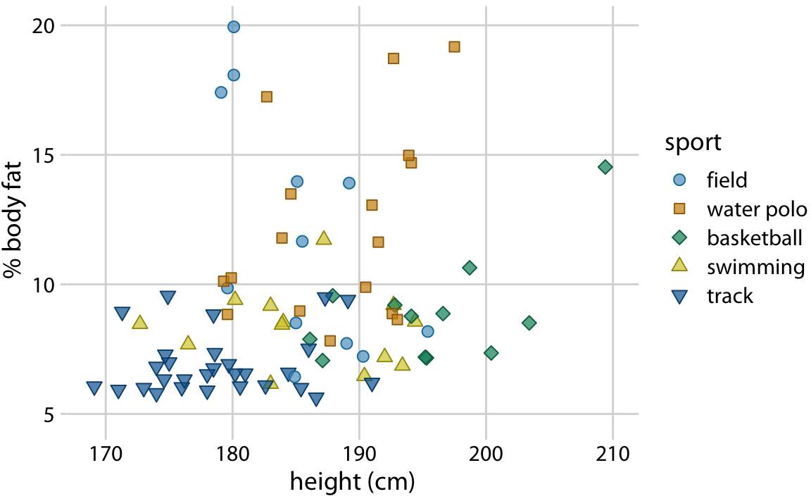
Figure 23.2: Percent body fat versus height in professional male Australian athletes. This figure is a cleaned-up version of Figure 23.1. Unnecessary frames have been removed, minor grid lines have been removed, and major grid lines have been drawn in light gray to stand back relative to the data points. Data source: Telford and Cunningham (1991)
At the other extreme, we might end up with a figure such as Figure 23.3, which is a minimalist version of Figure 23.2. In this figure, the axis tick labels and titles have been made so faint that they are hard to see. If we just glance at the figure we will not immediately perceive what data is actually shown. We only see points floating in space. Moreover, the legend annotations are so faint that the points in the legend could be mistaken for data points. This effect is amplified because there is no clear visual separation between the plot area and the legend. Notice how the background grid in Figure 23.2 both anchors the points in space and sets off the data area from the legend area. Both of these effects have been lost in Figure 23.3.
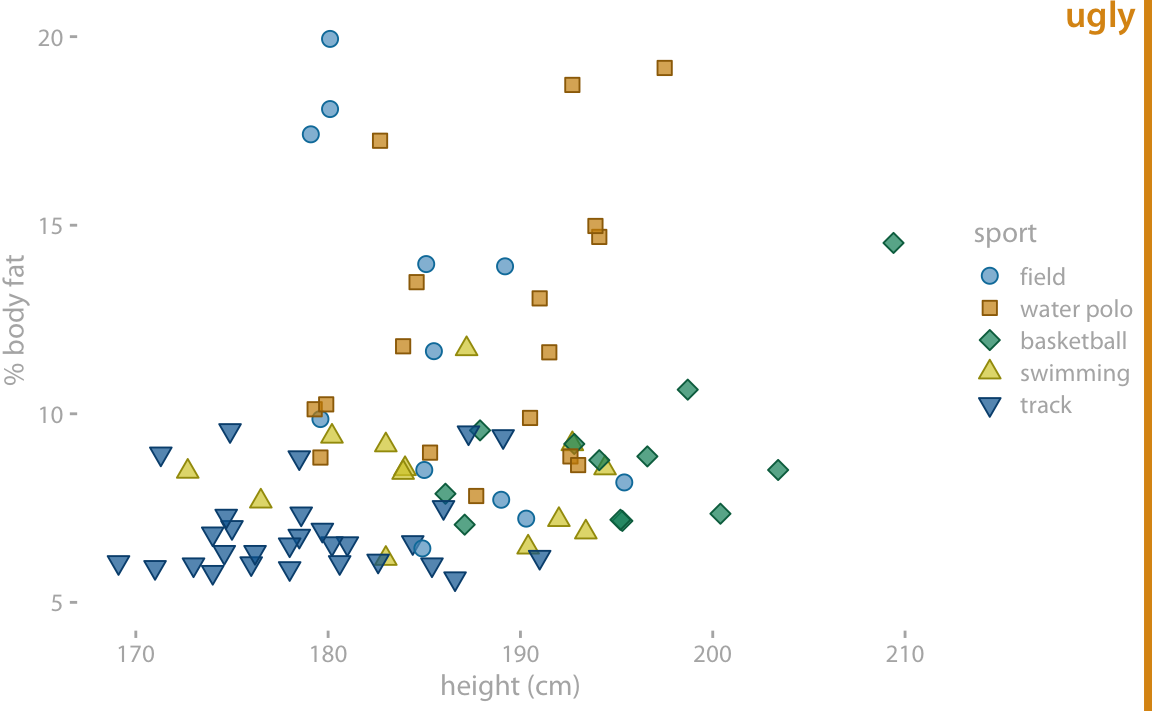
Figure 23.3: Percent body fat versus height in professional male Australian athletes. In this example, the concept of removing non-data ink has been taken too far. The axis tick labels and title are too faint and are barely visible. The data points seem to float in space. The points in the legend are not sufficiently set off from the data points, and the casual observer might think they are part of the data. Data source: Telford and Cunningham (1991)
In Figure 23.2, I am using an open background grid and no axis lines or frame around the plot panel. I like this design because it conveys to the reader that range of possible data values extends beyond the axis limits. For example, even though Figure 23.2 shows no athlete taller than 210 cm, such an athlete could conceivably exist. However, some authors prefer to delineate the extent of the plot panel, by drawing a frame around it (Figure 23.4). Both options are reasonable, and which is preferable is primarily a matter of personal opinion. One advantage of the framed version is that it clearly separates the legend from the plot panel.
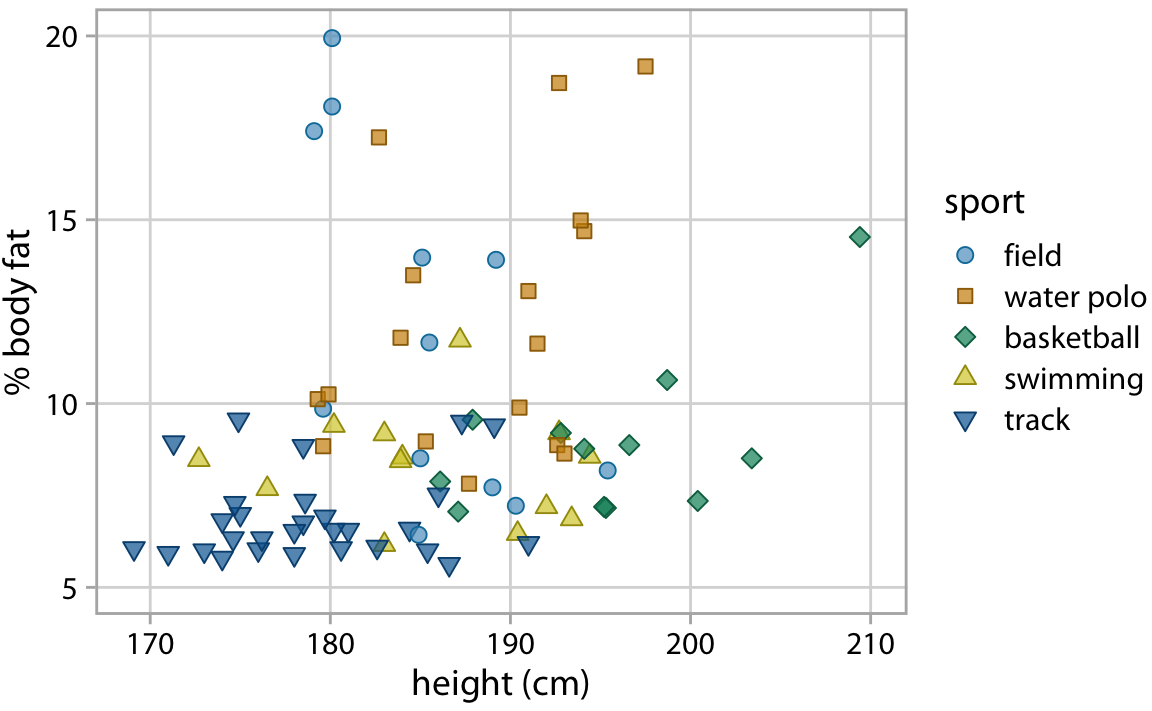
Figure 23.4: Percent body fat versus height in professional male Australian athletes. This figure adds a frame around the plot panel of Figure 23.2, and this frame helps separate the legend from the data. Data source: Telford and Cunningham (1991)
Figures with too little non-data ink commonly suffer from the effect that figure elements appear to float in space, without clear connection or reference to anything. This problem tends to be particularly severe in small multiples plots. Figure 23.5 shows a small-multiples plot comparing six different bar plots, but it looks more like a piece of modern art than a useful data visualization. The bars are not anchored to a clear baseline and the individual plot facets are not clearly delineated. We can resolve these issues by adding a light gray background and thin horizontal grid lines to each facet (Figure 23.6).
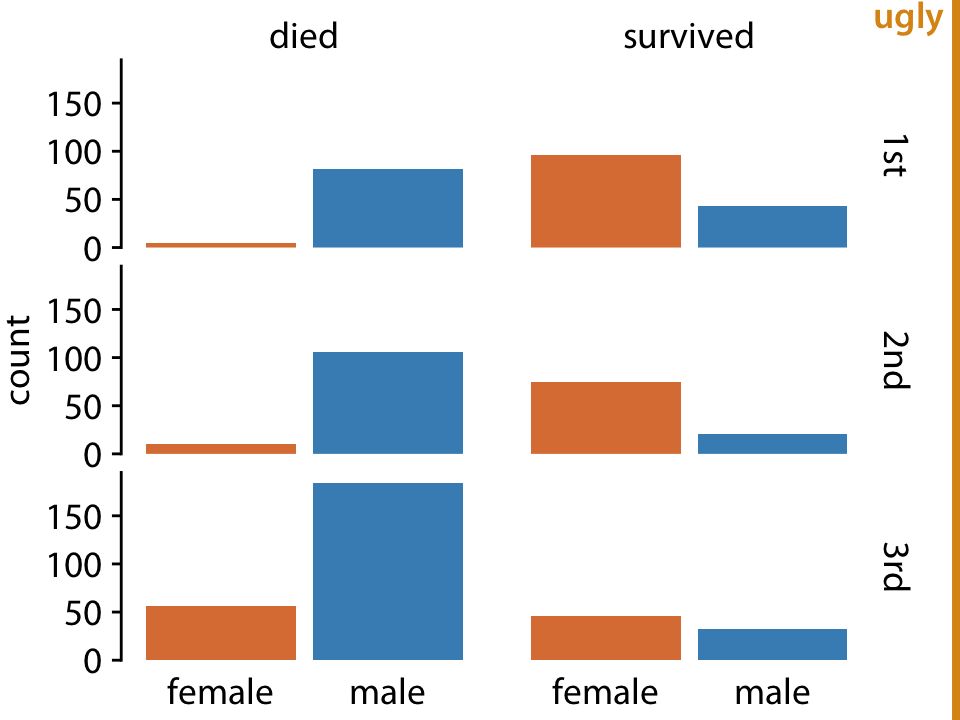
Figure 23.5: Survival of passengers on the Titanic, broken down by gender and class. This small-multiples plot is too minimalistic. The individual factes are not framed, so it’s difficult to see which part of the figure belongs to which facet. Further, the individual bars are not anchored to a clear baseline, and they seem to float.
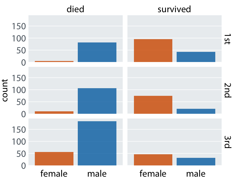
Figure 23.6: Survival of passengers on the Titanic, broken down by gender and class. This is an improved version of Figure 23.5. The gray background in each facet clearly delineates the six groupings (survived or died in first, second, or third class) that make up this plot. Thin horizontal lines in the background provide a reference for the bar heights and facility comparison of bar heights among facets.
23.2 Background grids
Gridlines in the background of a plot can help the reader discern specific data values and compare values in one part of a plot to values in another part. At the same time, gridlines can add visual noise, in particular when they are prominent or densely spaced. Reasonable people can disagree about whether to use a grid or not, and if so how to format it and how densely to space it. Throughout this book I am using a variety of different grid styles, to highlight that there isn’t necessarily one best choice.
The R software ggplot2 has popularized a style using a fairly prominent background grid of white lines on a gray background. Figure 23.7 shows an example in this style. The figure displays the change in stock price of four major tech companies over a five-year window, from 2012 to 2017. With apologies to the ggplot2 author Hadley Wickham, for whom I have the utmost respect, I don’t find the white-on-gray background grid particularly attractive. To my eye, the gray background can detract from the actual data, and a grid with major and minor lines can be too dense. I also find the gray squares in the legend confusing.
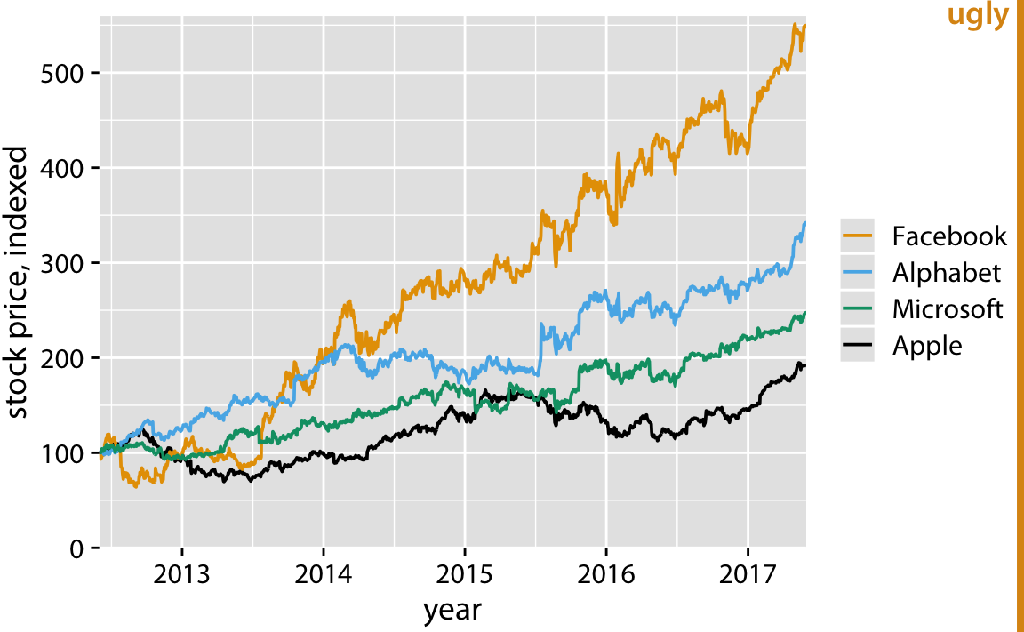
Figure 23.7: Stock price over time for four major tech companies. The stock price for each company has been normalized to equal 100 in June 2012. This figure mimics the ggplot2 default look, with white major and minor grid lines on a gray background. In this particular example, I think the grid lines overpower the data lines, and the result is a figure that is not well balanced and that doesn’t place sufficient emphasis on the data. Data source: Yahoo Finance
Arguments in favor of the gray background include that it (i) helps the plot to be perceived as a single visual entity and (ii) prevents the plot to appear as a white box in surrounding dark text (Wickham 2016). I completely agree with the first point, and it was the reason I used gray backgrounds in Figure 23.6. For the second point, I’d like to caution that the perceived darkness of text will depend on the font size, fontface, and line spacing, and the perceived darkness of a figure will depend on the absolute amount and color of ink used, including all data ink. A scientific paper typeset in dense, 10-point Times New Roman will look much darker than a coffee-table book typeset in 14-point Palatino with one-and-a-half line spacing. Likewise, a scatter plot of five points in yellow will look much lighter than a scatter plot of 10,000 points in black. If you want to use a gray figure background, consider the color intensity of your figure foreground, as well as the expected layout and typography of the text around your figures, and adjust the choice of your background gray accordingly. Otherwise, it could happen that your figures end up standing out as dark boxes among the surrounding lighter text. Also, keep in mind that the colors you use to plot your data need to work with the gray background. We tend to perceive colors differently against different backgrounds, and a gray background requires darker and more saturated foreground colors than a white background.
We can go all the way in the opposite direction and remove both the background and the grid lines (Figure 23.8). In this case, we need visible axis lines to frame the plot and keep it as a single visual unit. For this particular figure, I think this choice is a worse option, and I have labeled it as “bad”. In the absence of any background grid whatsoever, the curves seem to float in space, and it’s difficult to reference the final values on the right to the axis ticks on the left.
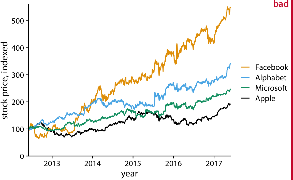
Figure 23.8: Indexed stock price over time for four major tech companies. In this variant of Figure 23.7, the data lines are not sufficiently anchored. This makes it difficult to ascertain to what extent they have deviated from the index value of 100 at the end of the covered time interval. Data source: Yahoo Finance
At the absolute minimum, we need to add one horizontal reference line. Since the stock prices in Figure 23.8 indexed to 100 in June 2012, marking this value with a thin horizontal line at y = 100 helps a lot (Figure 23.9). Alternatively, we can use a minimal “grid” of horizontal lines. For a plot where we are primarily interested in the change in y values, vertical grid lines are not needed. Moreover, grid lines positioned at only the major axis ticks will often be sufficient. And, the axis line can be omitted or made very thin, since the horzontal lines clearly mark the extent of the plot (Figure 23.10).
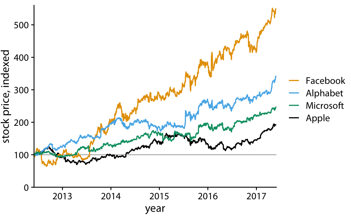
Figure 23.9: Indexed stock price over time for four major tech companies. Adding a thin horizontal line at the index value of 100 to Figure 23.8 helps provide an important reference throughout the entire time period the plot spans. Data source: Yahoo Finance
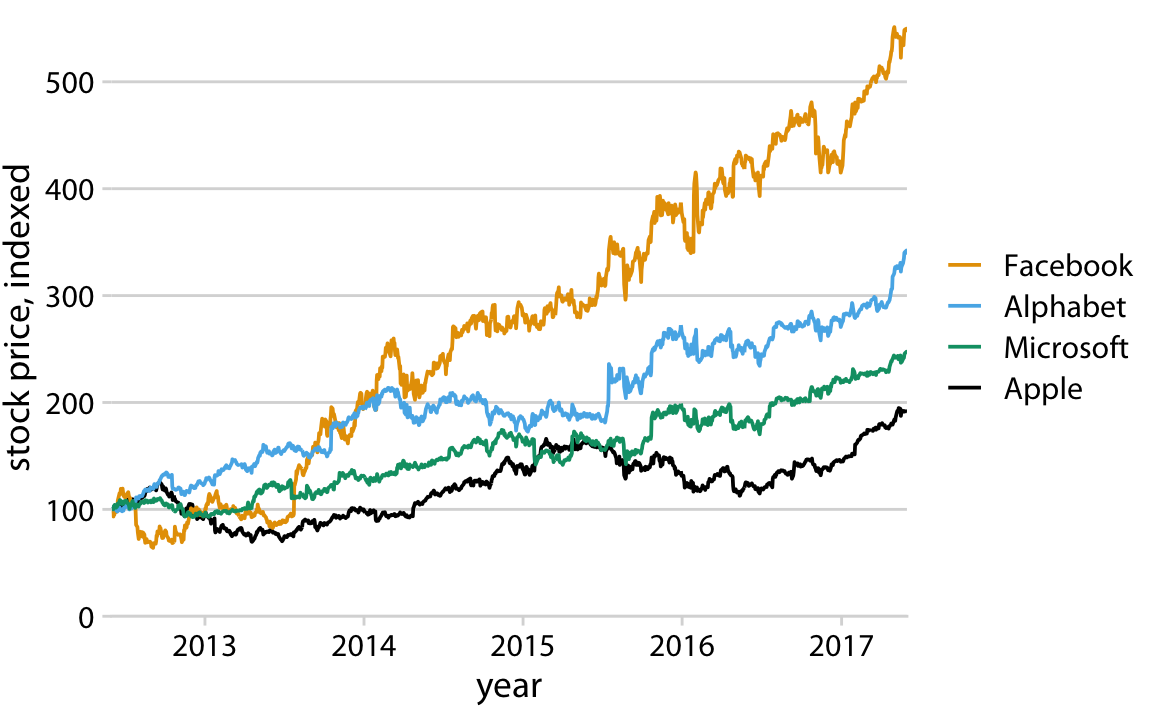
Figure 23.10: Indexed stock price over time for four major tech companies. Adding thin horizontal lines at all major y axis ticks provides a better set of reference points than just the one horizontal line of Figure 23.9. This design also removes the need for prominent x and y axis lines, since the evenly spaced horizontal lines create a visual frame for the plot panel. Data source: Yahoo Finance
For such a minimal grid, we generally draw the lines orthogonally to direction along which the numbers of interest vary. Therefore, if instead of plotting the stock price over time we plot the five-year increase, as horizontal bars, then we will want to use vertical lines instead (Figure 23.11).
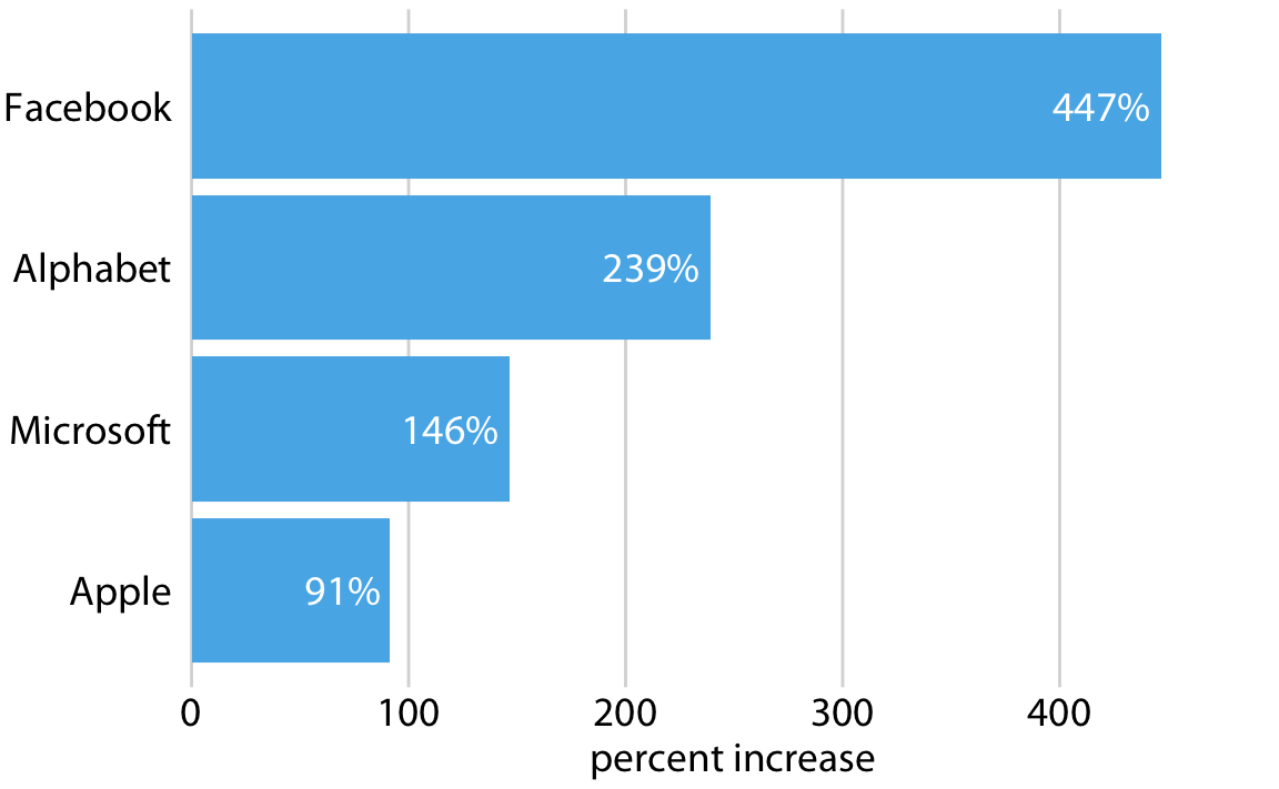
Figure 23.11: Percent increase in stock price from June 2012 to June 2017, for four major tech companies. Because the bars run horizontally, vertical grid lines are appropriate here. Data source: Yahoo Finance
Grid lines that run perpendicular to the key variable of interest tend to be the most useful.
For bar graphs such as Figure 23.11, Tufte (2001) recommends to draw white grid lines on top of the bars instead of dark grid lines underneath (Figure 23.12). These white grid lines have the effect of separating the bars into distinct segments of equal length. I’m of two minds on this style. On the one hand, research into human perception suggests that breaking bars into discrete segments helps the reader to perceive bar lengths (Haroz, Kosara, and Franconeri 2015). On the other hand, to my eye the bars look like they are falling apart and don’t form a clear visual unit. In fact, I used this style purposefully in Figure 6.10 to visually separate stacked bars representing male and female passengers. Which effect dominates may depend on the specific choices of bar width, distance between bars, and thickness of the white grid lines. Thus, if you intend to use this style, I encourage you to vary these parameters until you have a figure that creates the desired visual effect.
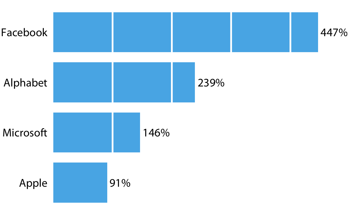
Figure 23.12: Percent increase in stock price from June 2012 to June 2017, for four major tech companies. White grid lines on top of bars can help the reader perceive the relative lengths of the bars. At the same time, they can also create the perception that the bars are falling apart. Data source: Yahoo Finance
I would like to point out another downside of Figure 23.12. I had to move the percentage values outside the bars, because the labels didn’t fit into the final segments of several of the bars. However, this choice inappropriately visually elongates the bars and should be avoided whenever possible.
Background grids along both axis directions are most appropriate for scatter plots where there is no primary axis of interest. Figure 23.2 at the beginning of this chapter provides an example. When a figure has a full background grid, axis lines are generally not needed (Figure 23.2).
23.3 Paired data
For figures where the relevant comparison is the x = y line, such as in scatter plots of paired data, I prefer to draw a diagonal line rather than a grid. For example, consider Figure 23.13, which compares gene expression levels in a mutant virus to the non-mutated (wild-type) variant. By drawing the diagonal line, we can see immediately which genes are expressed higher or lower in the mutant relative to the wild type. The same observation is much harder to make when the figure has a background grid and no diagonal line (Figure 23.14). Thus, even though Figure 23.14 looks pleasing, I label it as bad. In particular, gene 10A, which clearly has a reduced expression level in the mutant relative to the wild-type (Figure 23.13), does not visually stand out in Figure 23.14.
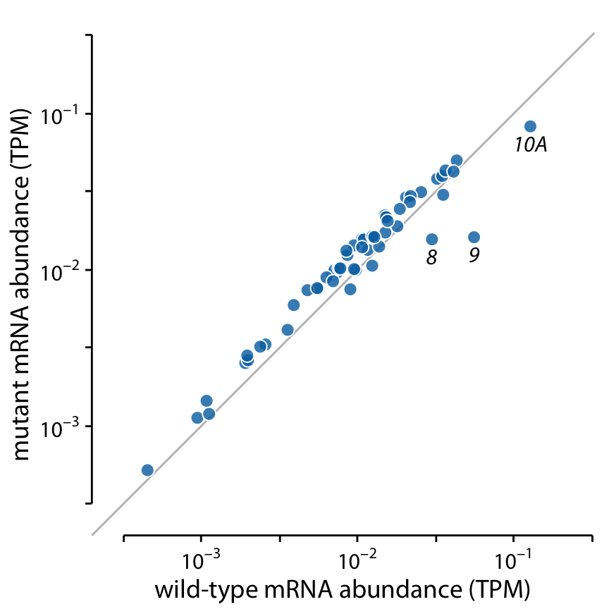
Figure 23.13: Gene expression levels in a mutant bacteriophage T7 relative to wild-type. Gene expression levels are measured by mRNA abundances, in transcripts per million (TPM). Each dot corresponds to one gene. In the mutant bacteriophage T7, the promoter in front of gene 9 was deleted, and this resulted in reduced mRNA abundances of gene 9 as well as the neighboring genes 8 and 10A (highlighted). Data source: Paff et al. (2018)
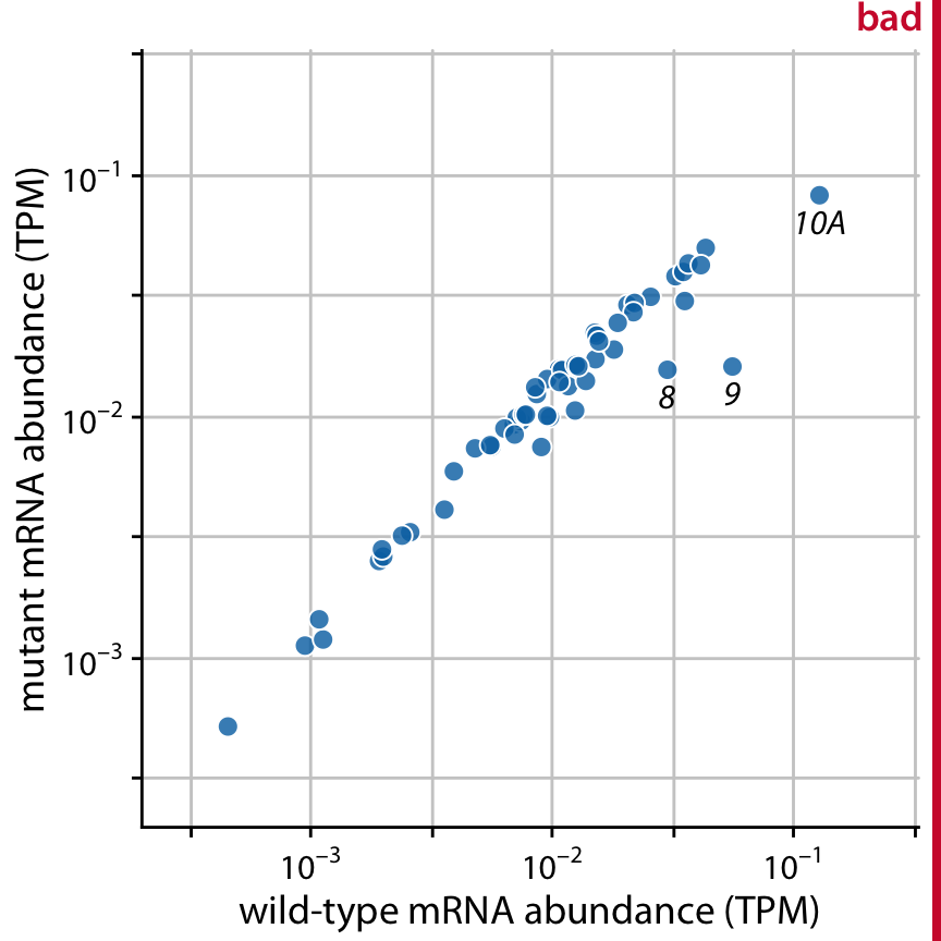
Figure 23.14: Gene expression levels in a mutant bacteriophage T7 relative to wild-type. By plotting this dataset against a background grid, instead of a diagonal line, we are obscuring which genes are higher or lower in the mutant than in the wild-type bacteriophage. Data source: Paff et al. (2018)
Of course we could take the diagonal line from Figure 23.13 and add it on top of the background grid of Figure 23.14, to ensure that the relevant visual reference is present. However, the resulting figure is getting quite busy (Figure 23.15). I had to make the diagonal line darker so it would stand out against the background grid, but now the data points almost seem to fade into the background. We could ameliorate this issue by making the data points larger or darker, but all considered I’d rather choose Figure 23.13.
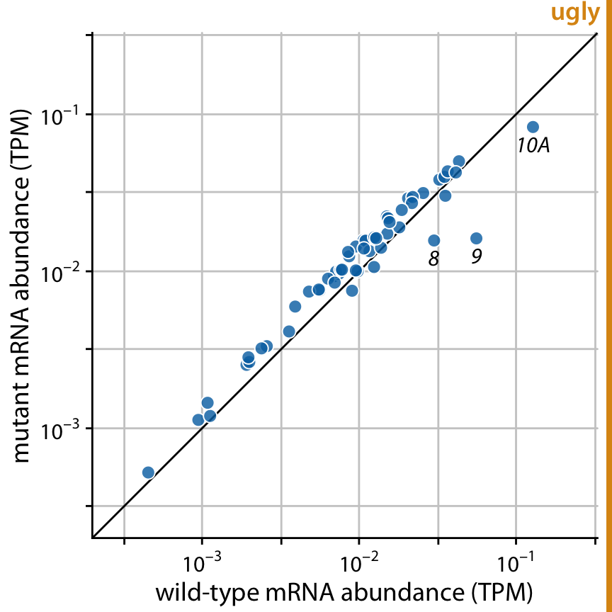
Figure 23.15: Gene expression levels in a mutant bacteriophage T7 relative to wild-type. This figure combines the background grid from Figure 23.14 with the diagonal line from Figure 23.13. In my opinion, this figure is visually too busy compared to Figure 23.13, and I would prefer Figure 23.13. Data source: Paff et al. (2018)
23.4 Summary
Both overloading a figure with non-data ink and excessively erasing non-data ink can result in poor figure design. We need to find a healthy medium, where the data points are the main emphasis of the figure while sufficient context is provided about what data is shown, where the points lie relative to each other, and what they mean.
With respect to backgrounds and background grids, there is no one choice that is preferable in all contexts. I recommend to be judicious about grid lines. Think carefully about which specific grid or guide lines are most informative for the plot you are making, and then only show those. I prefer minimal, light grids on a white background, since white is the default neutral color on paper and supports nearly any foreground color. However, a shaded background can help the plot appear as a single visual entity, and this may be particularly useful in small multiples plots. Finally, we have to consider how all these choices relate to visual branding and identity. Many magazines and websites like to have an immediately recognizable in-house style, and a shaded background and specific choice of background grid can help create a unique visual identity.
References
Tufte, E. 2001. The Visual Display of Quantitative Information. 2nd ed. Cheshire, Connecticut: Graphics Press.
Telford, R. D., and R. B. Cunningham. 1991. “Sex, Sport, and Body-Size Dependency of Hematology in Highly Trained Athletes.” Medicine and Science in Sports and Exercise 23: 788–94.
Wickham, H. 2016. ggplot2: Elegant Graphics for Data Analysis. 2nd ed. New York: Springer.
Haroz, S., R. Kosara, and S. L. Franconeri. 2015. “ISOTYPE Visualization: Working Memory, Performance, and Engagement with Pictographs.” ACM Conference on Human Factors in Computing Systems, 1191–1200. doi:10.1145/2702123.2702275.
Paff, M. L., B. R. Jack, B. L. Smith, J. J. Bull, and C. O. Wilke. 2018. “Combinatorial Approaches to Viral Attenuation.” bioRxiv, 29918. doi:10.1101/299180.