24 Use larger axis labels
If you take away only one single lesson from this book, make it this one: Pay attention to your axis labels, axis tick labels, and other assorted plot annotations. Chances are they are too small. In my experience, nearly all plot libraries and graphing softwares have poor defaults. If you use the default values, you’re almost certainly making a poor choice.
For example, consider Figure 24.1. I see figures like this all the time. The axis labels, axis tick labels, and legend labels are all incredibly small. We can barely see them, and we may have to zoom into the page to read the annotations in the legend.
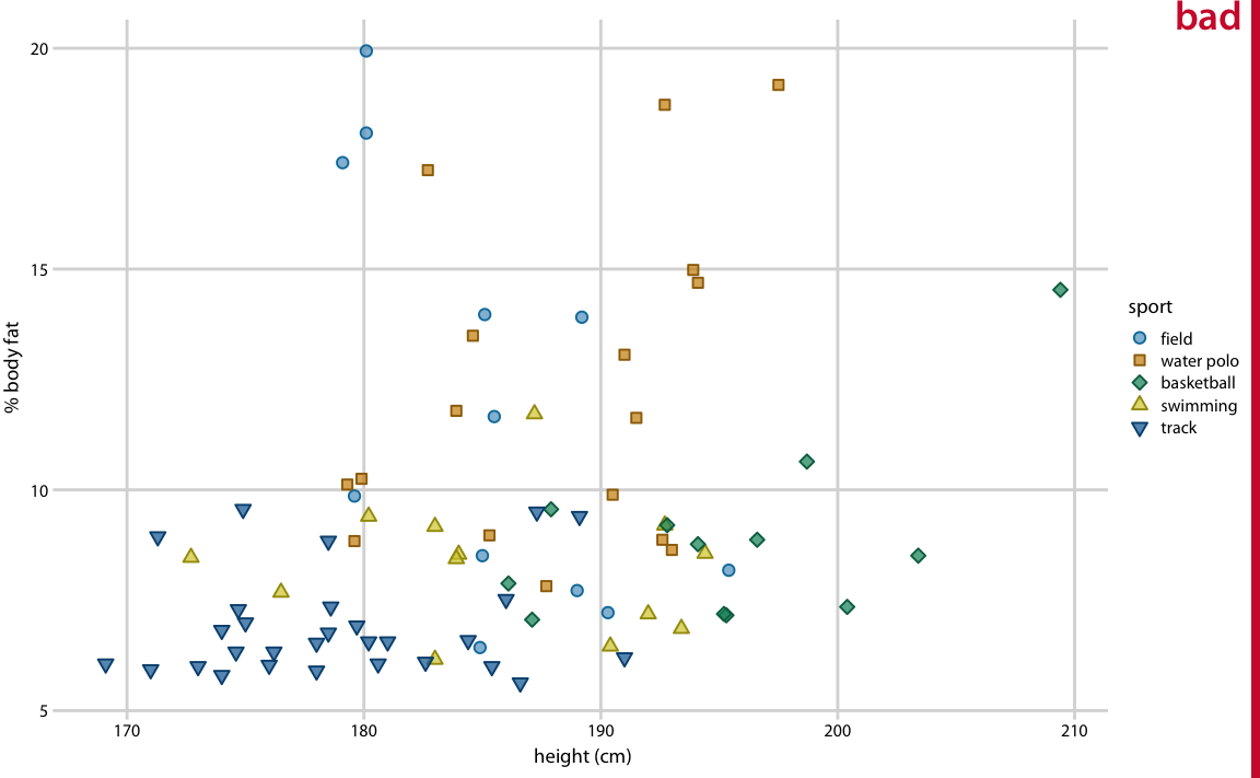
Figure 24.1: Percent body fat versus height in professional male Australian athletes. (Each point represents one athlete.) This figure suffers from the common affliction that the text elements are way too small and are barely legible. Data source: Telford and Cunningham (1991)
A somewhat better version of this figure is shown as Figure 24.2. I think the fonts are still too small, and that’s why I have labeled the figure as ugly. However, we are moving in the right direction. This figure might be passable under some circumstances. My main criticism here is not so much that the labels aren’t legible as that the figure is not balanced; the text elements are too small compared to the rest of the figure.
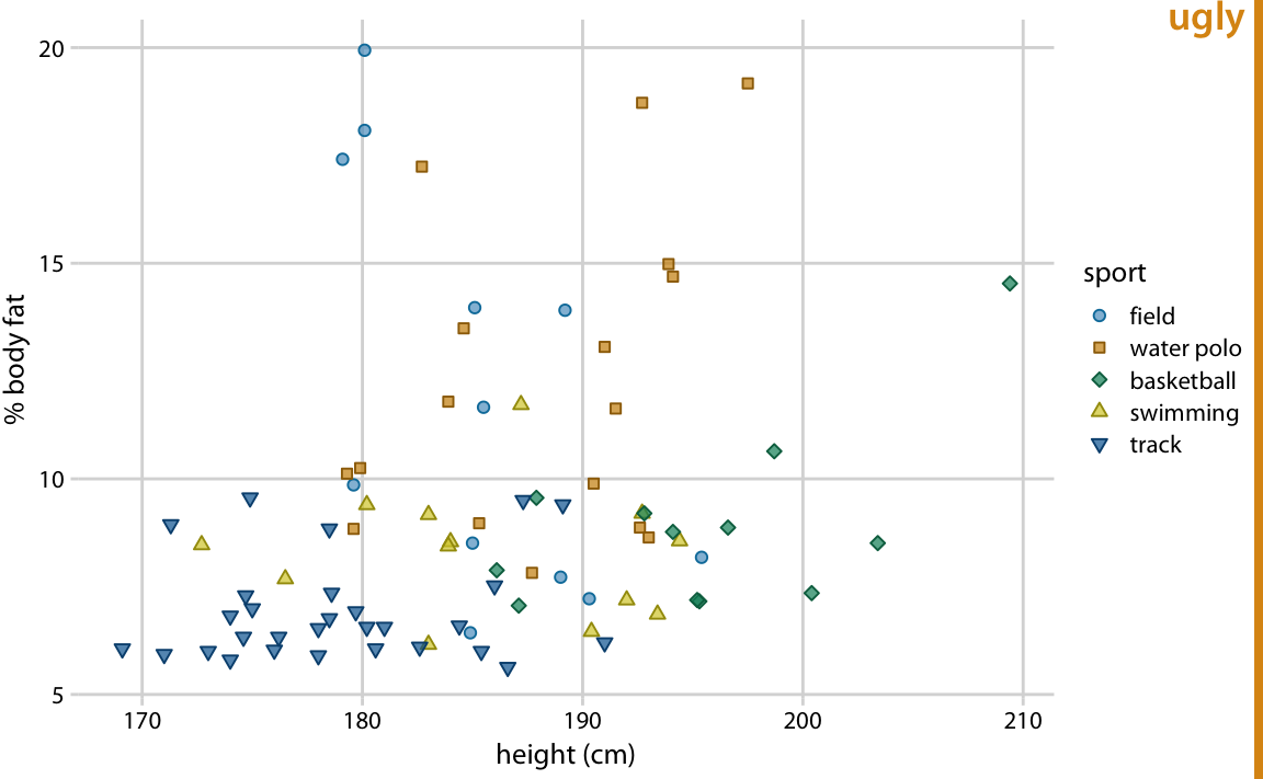
Figure 24.2: Percent body fat versus height in male athletes. This figure is an improvement over Figure 24.1, but the text elements remain too small and the figure is not balanced. Data source: Telford and Cunningham (1991)
The next figure uses the default settings I’m applying throughout this book. I think it is well balanced, the text is clearly visible, and it fits with the overall size of the figure.
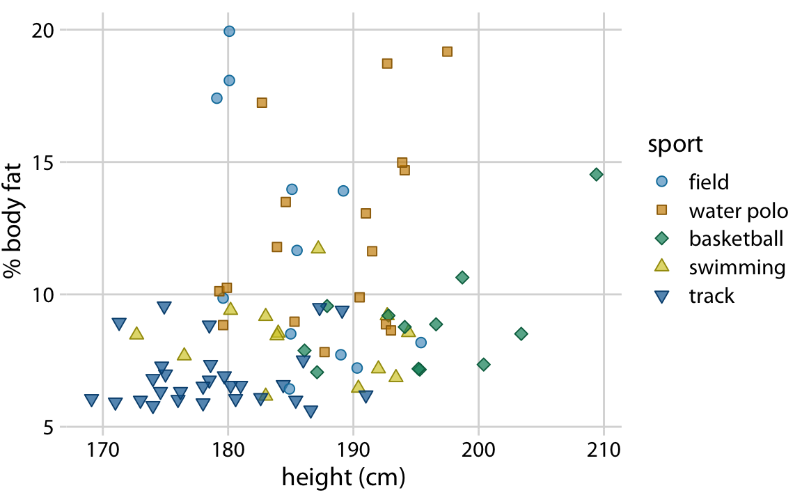
Figure 24.3: Percent body fat versus height in male athletes. All figure elements are appropriately scaled. Data source: Telford and Cunningham (1991)
Importantly, we can overdo it and make the labels too big (Figure 24.4). Sometimes we need big labels, for example if the figure is meant to be reduced in size, but the various elements of the figure (in particular, label text and plot symbols) need to fit together. In Figure 24.4, the points used to visualize the data are too small relative to the text. Once we fix this issue, the figure becomes acceptable again (Figure 24.5).
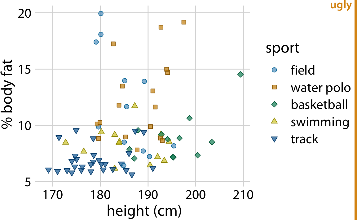
Figure 24.4: Percent body fat versus height in male athletes. The text elements are fairly large, and their size may be appropriate if the figure is meant to be reproduced at a very small scale. However, the figure overall is not balanced; the points are too small relative to the text elements. Data source: Telford and Cunningham (1991)
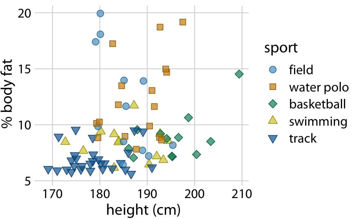
Figure 24.5: Percent body fat versus height in male athletes. All figure elements are sized such that the figure is balanced and can be reproduced at a small scale. Data source: Telford and Cunningham (1991)
You may look at Figure 24.5 and find everything too big. However, keep in mind that it is meant to be scaled down. Scale the figure down so that it is only an inch or two in width, and it looks just fine. In fact, at that scaling this is the only figure in this chapter that looks good.
Always look at scaled-down versions of your figures to make sure the axis labels are appropriately sized.
I think there is a simple psychological reason for why we routinely make figures whose axis labels are too small, and it relates to large, high-resolution computer monitors. We routinely preview figures on the computer screen, and often we do so while the figure takes up a large amount of space on the screen. In this viewing mode, even comparatively small text seems perfectly fine and legible, and large text can seem awkward and overpowering. In fact, if you take the first figure from this chapter and magnify it to the point where it fills your entire screen, you will likely think that it looks just fine. The solution is to always make sure that you look at your figures at a realistic print size. You can either zoom out so they are only three to five inches in width on your screen, or you can go to the other side of your room and check whether the figure still looks good from a substantial distance.
References
Telford, R. D., and R. B. Cunningham. 1991. “Sex, Sport, and Body-Size Dependency of Hematology in Highly Trained Athletes.” Medicine and Science in Sports and Exercise 23: 788–94.